
Table of Contents
Most people assume Zen interiors require complete color neutrality—endless expanses of white, beige, and gray. While minimalism is central to Zen design, this interpretation misses a crucial element of Japanese aesthetic philosophy.
Wabi-sabi, the art of finding beauty in imperfection and impermanence, doesn’t demand sterility. It celebrates authenticity, natural materials, and the subtle interplay of contrasts. Red accents, when chosen thoughtfully, don’t disrupt Zen spaces but enhance them instead.
This post explores why muted red tones belong in wabi-sabi interiors and how to incorporate them without compromising the calm, meditative atmosphere you’re creating.
Understanding Zen Aesthetics and Wabi-Sabi
Before exploring how red accents work in these spaces, it’s essential to understand the philosophies that shape them.
Zen Aesthetics emerged from Zen Buddhism and focuses on revealing the essence of things through simplicity. The core principles include:
- Kanso (Simplicity): Elimination of clutter and complexity. Every element serves a purpose.
- Fukinsei (Asymmetry): Rejection of perfect symmetry in favor of natural, organic balance.
- Shizen (Naturalness): Absence of pretense or forced design. Materials and colors appear as they exist in nature.
- Yugen (Subtle Profundity): Depth and mystery that invites contemplation rather than immediate understanding.
- Datsuzoku (Freedom from Convention): Breaking from rigid formulas while maintaining harmony.
- Seijaku (Tranquility): The ultimate goal—creating spaces that promote inner peace and stillness.
These principles guide every design decision in Zen interiors, from furniture selection to color choice.
Wabi-Sabi takes these principles further by embracing imperfection and transience. The term combines two concepts:
- Wabi: Originally meant loneliness or desolation, but evolved to describe rustic simplicity, freshness, and quietness. It finds richness in modesty and contentment in natural, unadorned objects.
- Sabi: The beauty that comes with age, wear, and patina. It celebrates the marks time leaves on objects and spaces.
Together, wabi-sabi creates an aesthetic that values authenticity over perfection, age over newness, and subtle beauty over obvious decoration. A wabi-sabi interior might feature weathered wood, handmade ceramics with irregular glazes, or textiles that show gentle fading from sunlight.
The Difference from Western Minimalism: While both Zen design and Western minimalism favor clean lines and reduced clutter, they diverge in intent and execution. Western minimalism often pursues sleek perfection and can feel cold or austere. Zen minimalism and wabi-sabi embrace warmth, texture, imperfection, and the passage of time. A scratch on a wooden table is part of the object’s story not a flaw.
This philosophical foundation explains why color, particularly muted red, has a place in these spaces. Wabi-sabi doesn’t reject all ornamentation or color. It rejects the artificial, the excessive, and the overly perfect. A faded red pillow made from natural linen embodies wabi-sabi principles. It’s simple but not sterile, intentional but not contrived.
Reason 1: Red Has Deep Roots in East Asian Tradition
Red is foundational to Eastern design. Walk through Kyoto and you’ll encounter vermilion torii gates at Shinto shrines, red-lacquered temples, and traditional tea houses with subtle red accents. In Japanese culture, red (aka) represents life force, protection, and vitality. Chinese design similarly honors red as an auspicious color tied to prosperity and joy.

Traditional East Asian spaces use red intentionally and sparingly, not as overwhelming decoration. A single red element against natural wood and neutral walls creates visual poetry not chaos.
The reds used in historical Japanese interiors also differ from bright Western reds. Think oxidized temple pillars, faded silk cushions, and aged lacquerware. These weathered, earthy tones align perfectly with wabi-sabi’s embrace of aging and natural transformation.
When you add a rust-toned canvas or terracotta pillow to your space, you’re honoring Zen tradition without breaking it.
Reason 2: The Principle of Contrast Creates Visual Harmony
Wabi-sabi philosophy recognizes that beauty emerges from tension between opposites—rough and smooth, dark and light, stillness and movement.
A red accent in a neutral room creates this essential contrast. Your eye finds a focal point, a place to rest and return to. This isn’t disruption. It’s intentional design that mirrors natural landscapes where a single autumn leaf stands out against gray stones, or a red maple punctuates a misty mountain view.
Japanese aesthetics specifically embrace the “one point of color” principle (known as sashiiro in traditional design). A single color element in an otherwise monochromatic space creates depth and prevents visual monotony. It gives the eye a destination while maintaining overall simplicity.
This approach transforms minimalism from cold austerity into warm mindfulness. The red accent becomes a meditation point, drawing awareness without demanding attention. It exists in the space the way a stone exists in a Zen garden—purposeful, grounding, complete.
Reason 3: Red Grounds Minimalist Spaces in Warmth
Minimalism done poorly feels sterile. All-white or all-gray rooms can evoke hospitals or corporate offices rather than sanctuaries.
Red accents solve this problem by introducing human warmth. Terracotta, rust, and burgundy tones carry inherent coziness. They reference fire, earth, and natural clay—elements that have provided comfort and safety throughout human history.
These warm reds prevent your Zen space from feeling disconnected or austere. A single burnt sienna pillow on a neutral sofa makes the room inviting rather than cold. A faded crimson canvas above a meditation corner adds soul without clutter.
The psychological impact matters too. While bright reds can increase heart rate and stimulate activity, muted earthy reds create the opposite effect. Dusty rose-reds and deep burgundies have a grounding, cocooning quality. They feel like sunset light filtering through paper screens—gentle, warm, reassuring.
This warmth supports Zen principles. A space designed for reflection and peace must first feel safe and welcoming. The right red accents create that foundation.
Reason 4: It Honors the Imperfect and Aged
Wabi-sabi celebrates impermanence and the beauty of aging. Nothing embodies this better than faded, oxidized red tones.
Bright, saturated red suggests newness and perfection. Faded red tells a story. It evokes weathered temple wood, antique textiles that have softened over decades, pottery glazes that have shifted with firing and time. These colors carry visual history.
When you choose rust or oxidized red accents, you’re selecting colors that reference natural processes—iron turning to rust, leaves changing in autumn, clay fired in ancient kilns. Instead of manufactured, artificial tones, they’re colors that appear when materials interact with time and elements.
Connection to natural aging makes muted reds ideal for wabi-sabi interiors. A terracotta-toned canvas doesn’t look like it’s trying too hard, but instead looks like it’s been part of the space forever, quietly aging alongside the room itself.
The imperfection matters too. Wabi-sabi rejects glossy, flawless surfaces. Muted reds on natural materials like linen or canvas have inherent texture and variation. The color shifts slightly in different lights. Some areas appear more faded than others. This organic inconsistency is the point.
Reason 5: Red Creates Intentional Energy Flow
Feng shui and Japanese spatial design both recognize that color influences energy movement through a room.
Red, even in muted forms, activates space. It doesn’t overstimulate like neon or primary red, but it does create gentle energetic nodes. A rust-colored pillow on a reading chair makes that corner feel purposeful. A burgundy canvas on a feature wall gives that area visual weight and significance.
Strategic placement matters. Red accents work best in areas where you want to encourage mindful pause—beside a meditation cushion, above a low table used for tea ceremony, in a reading nook. The color creates subtle activation without demanding constant attention.
The key is breathing room. One or two red accents in a larger neutral space allow the color to resonate without overwhelming. The negative space around the red element becomes as important as the element itself—a core principle of Japanese design.
This controlled use of color creates visual rhythm. Your eye moves through the space, finds the red accent, rests there briefly, then continues. The room feels balanced rather than static, alive rather than cluttered.
5 Common Red Accent Mistakes That Break Zen Harmony

Understanding what works helps, but recognizing what doesn’t prevents costly mistakes. Here are the most common errors people make when adding red to Zen interiors:
Mistake 1: Using Too Many Red Items
The impulse to add multiple red accents throughout a room destroys the focal point principle. Three red pillows, a red throw, and a red vase create visual scatter rather than intentional design. Zen aesthetics value restraint. One perfectly placed red canvas creates more impact than five red accessories competing for attention.
The fix: Start with a single red element. Live with it for at least a week. If the space genuinely needs a second red accent, add it sparingly. Two red items maximum in most rooms.
Mistake 2: Choosing Overly Bright or Neon Reds
Primary red, fire-engine red, or cherry red feel aggressive and stimulating. They trigger alertness rather than calm. These saturated tones belong in modern, energetic spaces—not wabi-sabi interiors seeking tranquility.
The fix: Test your red choice. If it feels “loud” or makes you think of sports cars, children’s toys, or warning signs, it’s too bright. Seek reds that remind you of earth, aged wood, autumn leaves, or sunset.
Mistake 3: Poor Placement That Creates Visual Clutter
Placing a red accent in a high-traffic area, near a busy visual zone, or competing with architectural features breaks the sense of calm. A red pillow next to a gallery wall, near a television, or in a narrow hallway creates chaos rather than focus.
The fix: Red accents need visual breathing room. Place them against neutral backgrounds with minimal competing elements. The space around the red should be calm and uncluttered.
Mistake 4: Ignoring Surrounding Color Temperature
Mixing cool-toned rooms (gray walls, white oak floors, blue undertones) with warm terracotta reds creates visual discord. Similarly, pairing warm cream walls with cool burgundy can feel off-balance.
The fix: Match color temperatures. Cool spaces want burgundy or faded crimson. Warm spaces want terracotta, rust, or burnt sienna. When in doubt, dusty rose-red bridges both temperatures.
Mistake 5: Mixing Conflicting Red Undertones
Adding a burgundy pillow (cool-toned) next to a terracotta vase (warm-toned) creates subtle tension. Most people can’t articulate why it feels wrong, but the conflicting undertones create visual unease.
The fix: Choose one red family and stick with it. If you use two red items in a space, they should share the same undertone—both warm or both cool.
How to Use Red Accents in Different Spaces
Red accents work throughout the home, but each room benefits from specific tones and placements tailored to its function.
Bedroom: Deep Burgundy for Restful Energy
Bedrooms require the most careful color choices since they’re spaces for rest and intimacy. Deep burgundy or faded crimson work best here. These darker, cooler-toned reds create a cocooning effect without stimulation.
Place a burgundy linen pillowcase on the bed as a subtle accent against white or cream bedding. Alternatively, hang a small burgundy-toned canvas above a low dresser or beside the bed. Avoid terracotta or rust tones in bedrooms—their warmth can feel too activating for sleep spaces.
The key is using red sparingly. One pillowcase or one small canvas is sufficient. The bedroom should remain predominantly neutral, with red providing just enough visual interest to prevent sterility.
Living Room: Terracotta for Warmth and Gathering
Living rooms serve as gathering spaces and can handle slightly warmer, more welcoming reds. Terracotta and burnt sienna excel here, creating an inviting atmosphere for conversation and connection.
A terracotta throw pillow on a neutral sofa works beautifully, or a larger terracotta-toned canvas as a focal point above a low console. If you have a reading corner, a rust-colored cushion on your reading chair creates a defined, purposeful space.
Living rooms typically have more natural light than bedrooms, allowing terracotta tones to shift throughout the day. Morning light will make them appear softer and more muted, while afternoon sun brings out their warmth and depth.
Meditation/Yoga Space: Faded Crimson for Focus
Dedicated meditation or yoga spaces benefit from reds that support concentration without stimulation. Faded crimson or dusty rose-red create gentle focal points that aid in mindfulness practice.
Consider a faded crimson canvas positioned where your gaze naturally falls during seated meditation. The weathered quality of faded crimson aligns with contemplative practice—it invites attention without demanding it.
Avoid placing red accents directly behind your meditation position where you won’t see them. Instead, position them where your eyes rest when you enter the space or pause between practices.
Home Office: Rust Tones for Grounded Creativity
Home offices require balance between focus and creativity. Rust and oxidized red tones provide gentle energetic activation while maintaining the calm necessary for deep work.
A rust-toned canvas beside your desk creates a visual rest point when you look away from screens. Avoid placing red accents directly in your primary sightline where they might prove distracting during focused tasks.
The earthy quality of rust tones grounds the often-digital nature of office work, connecting you back to natural materials and organic processes.
Entryway: Strategic Red as Welcoming Energy
Entryways set the tone for your entire home. A single red accent here creates an intentional threshold between outside chaos and interior calm.
Consider a terracotta or burnt sienna canvas in the entryway, positioned where you see it immediately upon entering. This creates a moment of pause, a visual signal to transition from the external world to your mindful interior space.
Keep entryway red accents to one item. This space transitions quickly to other rooms, so restraint prevents the accent from losing impact.
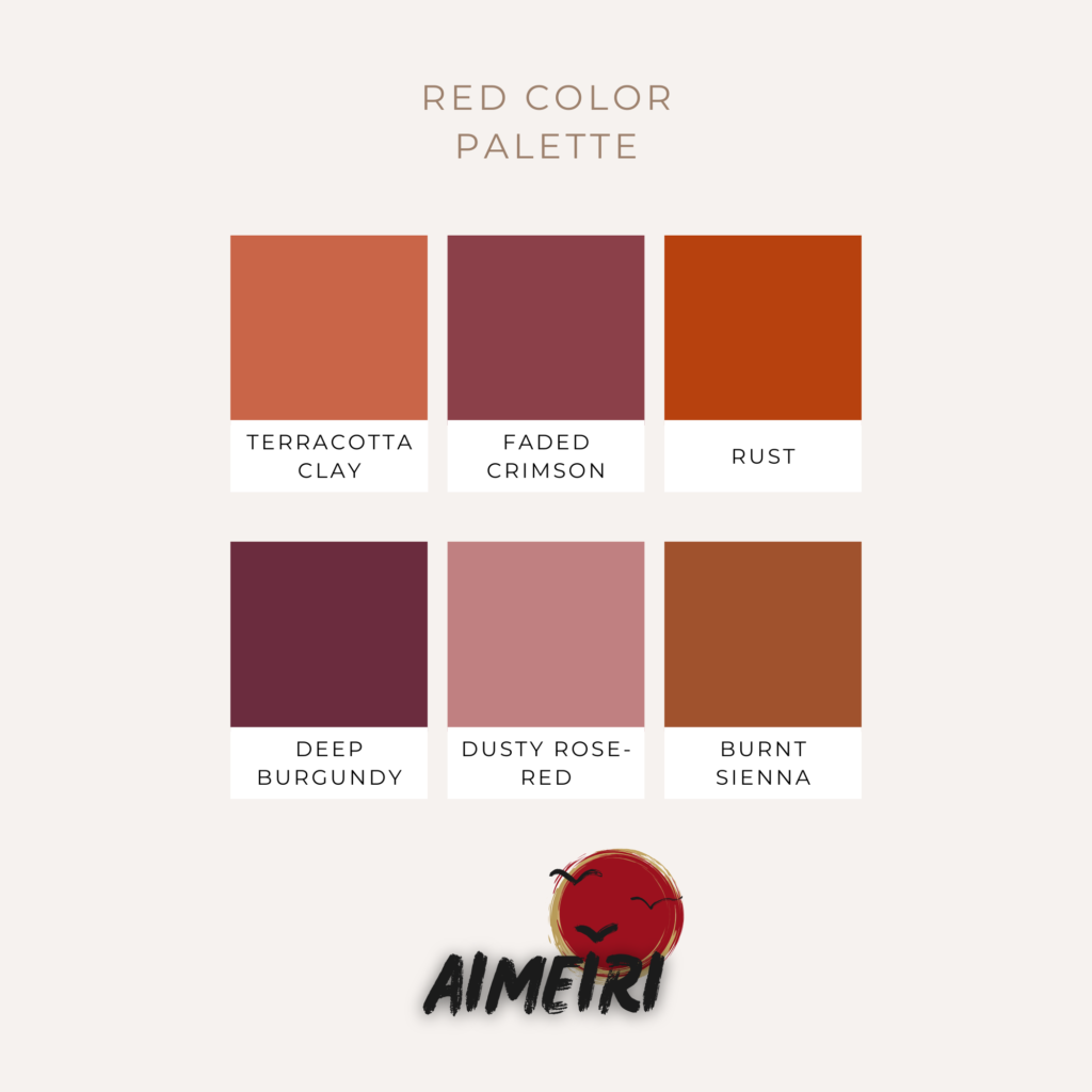
Wabi-Sabi Red Color Palette Guide
Not all reds work in Zen interiors. Here are the specific tones that align with wabi-sabi principles:
Terracotta Clay (#C96548): Earthy and grounded, this color references natural pottery and sun-baked earth. It pairs beautifully with warm whites, natural wood, and beige. Best for spaces with good natural light where the warmth can fully express itself.
Faded Crimson (#8B4049): This weathered tone evokes aged silk and antique textiles. It carries elegance without brightness, making it ideal for sophisticated minimalist spaces. Works well with cool grays and charcoal.
Rust/Oxidized Red (#B7410E): The color of iron meeting air and time. This tone references autumn leaves and natural patina. Pair with warm neutrals and natural materials like linen and unfinished wood.
Deep Burgundy (#6B2C3E): Rich but subdued, burgundy brings meditative depth to a space. It works in rooms with softer lighting where brighter reds would feel harsh. Excellent with both warm and cool neutrals.
Dusty Rose-Red (#C08081): Soft and muted with subtle pink undertones. This gentle tone adds warmth without strong visual weight. Perfect for smaller spaces or as a secondary accent.
Burnt Sienna (#A0522D): A warm earth tone with red undertones that references clay and dried earth. This versatile shade works across various lighting conditions and pairs well with nearly all neutrals.
Pairing with Neutral Bases: These reds shine against warm whites (cream, ivory, off-white), soft grays (greige, warm gray, taupe), natural beiges, unpainted wood tones, and charcoal. Avoid pairing with stark white or cool grays unless you want a more modern, less organic feel.
The undertone matching matters. Cool-toned grays pair best with burgundy and faded crimson. Warm beiges and creams work with terracotta, rust, and burnt sienna. Dusty rose-red bridges both, making it the most versatile option.
Tips for Choosing the Right Red Accent Piece

Start with One Statement Piece: Don’t scatter multiple red items throughout a room. Choose one canvas print, one pillow, or one textile. Let it anchor the space. You can add a second red element later if needed, but single accents create stronger impact in Zen design.
Consider Your Natural Light: Rooms with abundant natural light can handle warmer, brighter reds like terracotta and rust. The sunlight will soften and shift these tones throughout the day, creating natural variation. Spaces with limited or soft lighting benefit from deeper reds like burgundy, which create richness without requiring bright light to activate.
Match the Undertone: Examine your existing neutrals. Do your walls, furniture, and floors lean warm (cream, beige, honey wood) or cool (gray, white oak, charcoal)? Choose reds with matching undertones. Warm spaces want terracotta and rust. Cool spaces want burgundy and faded crimson.
Think About Texture: Glossy or shiny red accents feel modern and energetic—not wabi-sabi. Look for muted finishes on natural materials. Linen pillows, canvas prints, and textured ceramics in red tones feel organic and authentic. The material matters as much as the color.
Scale Matters: Large, open spaces can handle deeper, more saturated reds like burgundy or rust without feeling heavy. Smaller rooms benefit from softer, more faded tones like dusty rose-red or pale terracotta. The visual weight of the color should match the physical space.
Placement Guidelines: Red accents work best in zones designed for pause and presence. Consider placing them behind seating areas, beside meditation spaces, across from windows (where natural light will interact with the color), or on feature walls. Avoid placing red accents in high-traffic areas where they’ll create visual interruption rather than focal points.
The 60-30-10 Rule Adapted: Traditional interior design uses 60% dominant color, 30% secondary color, 10% accent color. For wabi-sabi spaces, think 60% neutral (walls, large furniture), 30% secondary neutral (smaller furniture, textiles), and 10% or less red accent. This maintains the minimalist foundation while adding intentional color.
Test Before Committing: Colors shift dramatically depending on surrounding elements. If possible, bring home a sample or use a returnable item to test how the red tone looks in your actual space. Observe it in morning light, afternoon light, and evening. Notice how it interacts with your existing neutrals. Trust your gut reaction after living with it for a few days.
Troubleshooting: Common Questions About Red in Zen Spaces
“My space still feels cold even with a red accent—what’s wrong?”
The issue likely isn’t the red accent itself but the surrounding elements. A single red pillow can’t warm a room dominated by cool grays, white walls, and metal furniture. Zen warmth comes from layering natural materials—wood, linen, wool, stone. Add a wooden side table, a wool throw in cream, or a jute rug. The red accent will feel warmer when surrounded by organic textures.
Also check your red’s undertone. If you have warm beige walls but chose burgundy (a cool red), the mismatch creates distance rather than warmth. Switch to terracotta or rust.
“Can I use red accents in a north-facing room?”
Yes, but choose your tone carefully. North-facing rooms receive cooler, more indirect light that can make reds appear dull or flat. Deep burgundy and faded crimson actually work well here—their richness comes through without needing bright light.
Avoid warm terracotta in north-facing spaces. Without direct sunlight, these tones can look muddy. If you prefer warmer reds, add a warm-toned light source (soft yellow-toned bulb) to compensate for the cool natural light.
“How do I transition from all-neutral to adding red?”
Start very small. Don’t immediately buy a large red canvas or multiple red pillows. Begin with a single small item—a red pillowcase, a small framed print, or even a red ceramic bowl.
Live with this small addition for two weeks. Notice how your eye interacts with it. Does it feel grounding or jarring? Does it warm the space or feel out of place? This testing period prevents expensive mistakes and helps you understand how red functions in your specific environment.
If the small item feels right after two weeks, consider adding a larger or second element. Move slowly. Zen design values patience and intentionality.
“What if I have existing wood tones—which red works?”
Match your red to the warmth and depth of your wood. Light, honey-colored woods (pine, light oak, maple) pair beautifully with terracotta and rust. These warm reds complement the wood without competing.
Dark woods (walnut, mahogany, dark-stained furniture) work better with deeper reds like burgundy or burnt sienna. The richness of dark wood needs a red with similar depth to create balance.
Medium wood tones are most versatile and work with nearly any wabi-sabi red. Let the other elements in your room (wall color, textile tones) guide your choice.
Bringing It Together
Red accents don’t violate Zen design principles—they fulfill them when used with intention.
The key lies in choosing muted, earthy tones that reference natural aging and traditional East Asian aesthetics. Terracotta, rust, faded crimson, and burgundy bring warmth, depth, and subtle vitality to minimalist spaces without creating visual chaos.
Start small. Add a single canvas print in oxidized red tones above your meditation corner. Place a terracotta linen pillow on your neutral sofa. Notice how the space shifts. The red doesn’t demand attention, but instead invites awareness. It creates a gentle focal point that grounds the room in warmth while maintaining the calm, uncluttered atmosphere essential to Zen interiors.
Wabi-sabi teaches us that beauty emerges from imperfection, impermanence, and the honest expression of materials. A weathered red accent embodies all three. It brings color that has evolved, that tells a story, that exists authentically in your space.
Remember the core principles as you integrate red into your Zen interior: restraint over abundance, natural materials over synthetic finishes, faded tones over bright saturation, intentional placement over scattered decoration. Each red accent should feel inevitable rather than added, as though it has always belonged in that exact spot.
The transformation won’t be dramatic—and that’s precisely the point. Wabi-sabi changes happen quietly, subtly, creating spaces that reveal their depth over time rather than announcing themselves immediately. Your red accent will become part of the room’s story, aging and shifting alongside the other elements, contributing to the ongoing evolution that makes wabi-sabi spaces feel alive.
Explore canvas prints and pillows in wabi-sabi red tones at AiMEiRi. Each piece is designed to honor soft artistic minimalism and East Asian philosophy, bringing intentional beauty to your Zen interior.