
Table of Contents
In Japan, there’s a phrase for what cherry blossoms represent: mono no aware (物の哀れ). The bittersweet awareness that beauty doesn’t last. The blossoms open for a week, maybe two. That brevity isn’t a flaw—it’s the whole point.
For over a thousand years, people across East Asia have gathered beneath blooming branches for hanami (花見)—not just to look at flowers, but to practice paying attention to something fleeting. And then letting it go.
Spring decorating, done thoughtfully, works the same way. You are not buying pink things and calling it a season, but intentionally shifting your home to reflect the moment you’re in. These seven ideas draw from Japanese, Korean, and Chinese aesthetic traditions to help you do exactly that.
The Sakura in Art and Culture: A Brief History
Cherry blossoms as a cultural symbol began during Japan’s Nara Period (710–794 CE), when the imperial court held gatherings beneath plum blossoms. By the Heian Period (794–1185 CE), sakura had taken over. The word hana—”flower” in modern Japanese—came to refer specifically to cherry blossoms, a measure of how completely they’d captured the culture.
In The Tale of Genji, blossoms appear again and again as beauty that cannot be held. The 18th-century poet Motoori Norinaga connected sakura directly to mono no aware: the Japanese sensitivity to life’s passing is best expressed through a falling petal. Not melancholy. Acute aliveness.
Visual art followed. During the Edo Period (1603–1868), ukiyo-e artists like Hiroshige and Hokusai made blossoms their primary subjects—against stormy skies, reflected in water, framed by mountains. Not background decoration. Subjects carrying philosophical weight.
Korean and Chinese traditions brought distinct approaches. Chinese gongbi painting renders flowers with meticulous precision—each petal a study in careful observation. Korean minhwa folk art uses peonies, chrysanthemums, and lotus blossoms to convey blessings and moral virtue. Both traditions understand flowers as language, not ornament.
This is the visual heritage you draw on when you bring these motifs into your home. Not to make decorating more complicated. To make it more meaningful.

The Philosophy Behind the Aesthetic
Before the ideas, a quick foundation.
Wabi-sabi (侘寂) finds beauty in imperfection and impermanence. A cracked ceramic bowl. An asymmetrical branch arrangement. Linen softened by washing. These are wabi-sabi moments—a counter to the Western preference for symmetry and permanence.
Ma (間) means negative space. The pause. The gap. The emptiness that gives everything else room to breathe. In Japanese art, what’s left out is as deliberate as what’s included. A single sakura branch in a simple vase can be more striking than an overflowing bouquet.
Korean minhwa and Chinese gongbi add their own layers. Peonies represent prosperity. Plum blossoms symbolize perseverance—they bloom in winter before any other flower dares to. Chrysanthemums evoke longevity. When you bring these motifs home, you’re drawing on centuries of visual language. Not decorating. Continuing a conversation.
The 7 Ideas
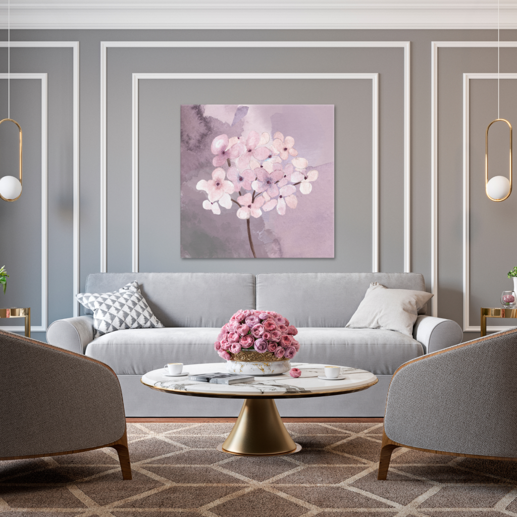
1. The Ikebana-Inspired Arrangement
Ikebana (生け花) isn’t flower arranging as the West understands it. Where Western bouquets aim for fullness and symmetry, ikebana builds on three elements: heaven (ten), earth (chi), and humanity (jin). Represented by branches and stems of different heights arranged asymmetrically, with significant empty space between them.
You don’t need formal training to apply its principles.
Start with a low, wide vessel—a celadon ceramic bowl, an unglazed stoneware dish, or a flat suiban tray. Choose one to three elements: a tall sakura branch, a shorter stem of greenery, a single open bloom at the base. Leave space between them. Resist filling it in.
The result should feel composed, not crowded. New to this? When you think you need one more stem, stop.
Sourcing note: Faux sakura branches in high-quality silk or dried pampas grass work well if fresh branches aren’t available. Avoid plastic. For vessels, search ceramicists on Etsy who work in the Japanese tradition—hand-thrown pieces with visible texture are far more interesting than store-bought options.
2. Shoji-Inspired Lighting
Traditional Japanese shoji screens (障子) are paper-and-wood panels that diffuse light rather than blocking it. The effect is a soft, even glow that shifts throughout the day—warm amber in late afternoon, cool blue in morning. Atmosphere without trying.
Rice paper lanterns, washi paper lampshades, or translucent panel screens near a light source recreate this quality. For spring, look for shades with pressed sakura silhouettes embedded in the paper. Or create your own using a simple folding screen and washi panels.
Pair with warm-temperature bulbs (2700K–3000K). The goal is indirect, diffused, warm—the opposite of overhead fluorescents.
Sourcing note: Japanese paper lanterns are widely available and inexpensive. For higher-quality options, look for handmade washi lamp shades from Japanese artisan sellers. IKEA’s KNAPPA and similar pendant shades are also compatible with this aesthetic when paired thoughtfully.
3. A Tokonoma-Inspired Seasonal Vignette
The tokonoma (床の間) is a recessed alcove in traditional Japanese rooms—a designated space for displaying a hanging scroll, a single flower arrangement, perhaps a ceramic object. It changes with the season. A home altar to the current moment.
Most homes don’t have a tokonoma. Any shelf, mantle, or corner can serve the same purpose.
The key is curation: three elements maximum. For spring, this might mean a framed sakura print, a small ikebana arrangement, and one meaningful object—a ceramic figurine, a smooth river stone, a lacquerware bowl.
Clear everything else off that surface. The vignette needs room to breathe. It should feel intentional rather than accumulated.
Seasonal ritual: Update this vignette four times a year. This practice of conscious seasonal rotation makes a home feel alive rather than static.
4. Floral Textile Layering
East Asian textile traditions are extraordinarily rich. Kyoto’s nishijin-ori brocades. Chinese silk embroidery. Korean bojagi patchwork. All use floral motifs—sakura, peony, plum blossom, lotus—with sophistication that’s hard to replicate but easy to draw from.
Layer floral-printed textiles in a way that feels considered rather than chaotic. A sakura-print table runner on natural linen. Peony-embroidered cushion covers against a solid, muted sofa. A furoshiki (wrapping cloth) stretched over a small frame as wall art.
Printed textiles need neutral companions. Pair bold florals with undyed linen, washed cotton, or raw silk in ivory, sage, or warm grey.
Sourcing note: Japanese furoshiki cloths are beautiful and versatile—they work as table runners, wall art, gift wrapping, and more. Search for traditional tenugui cotton cloths for a more affordable alternative with authentic floral patterns.
5. East Asian Floral Art as a Statement Wall
Japanese ukiyo-e woodblock prints, Korean minhwa folk paintings, and Chinese gongbi botanical illustrations offer something most Western floral art doesn’t: flowers as subjects with philosophical weight. A spray of plum blossoms isn’t just decorative. In Chinese tradition, it represents perseverance—blooming in winter before any other flower dares to.
You don’t need a gallery budget. High-quality reproductions of Hiroshige’s flower prints, traditional botanical studies, or contemporary East Asian artists working in classical styles are accessible at a range of price points. One strong piece framed simply does more than a grid of generic prints.
For framing: simple lacquered black, raw wood, or bamboo. Ornate gilded frames fight the aesthetic. If displaying multiple pieces, leave more wall space between them than feels comfortable. That negative space is doing work.
Supporting Asian artists: Platforms like Etsy, Society6, and direct artist websites have a growing number of East Asian artists working in traditional ink, watercolor, and print-making traditions. Buying directly supports the living continuation of these art forms.
6. The Ritual Tea Corner
The Japanese tea ceremony, chado (茶道)—”the way of tea”—builds on four principles from the 16th century: harmony (wa), respect (kei), purity (sei), and tranquility (jaku). Its core insight: beauty and meaning can be found in ordinary daily acts, approached with intention.
You don’t need formal chado to apply its spirit. A simple tea corner—a tray, a teapot, two cups, a small bud vase—can serve as a daily anchor for presence and slowness. Style it with sakura-motif teaware for spring, a small linen cloth beneath the tray, a single flower in the vase. Keep it clean and ready to use.
A beautiful space never used is just decoration. A beautiful space that’s part of your daily rhythm is something more.
Korean buncheong ceramics and Japanese yunomi cups both work here. Look for pieces with visible craftsmanship—a fingerprint in clay, an uneven glaze, a slightly irregular rim. These imperfections are the point.
The everyday ritual: Preparing tea slowly, without a phone in hand, is among the most accessible mindfulness practices. The tea corner is an invitation to do that. Set it up in a place where you’ll actually use it.
7. Living Decor: Moss, Branches, and Miniature Gardens
In Zen aesthetics, the goal isn’t bringing the outdoors in. It’s dissolving the boundary between the two. Satoyama (里山) describes the harmonious zone where human habitation and nature overlap. A well-designed living element captures this: not a plant plopped on a shelf, but nature settling in comfortably.
For spring: a kokedama (苔玉)—a plant grown in a moss ball, suspended with twine or resting in a ceramic dish. A low tray garden of fine gravel, a few stones, and a small blooming plant or sakura bonsai. A tall ceramic vase with sakura or quince branches arranged with ikebana principles.
For non-plant-parents: high-quality dried sakura branches hold their shape and color beautifully for a full season. Preserved moss panels need no maintenance and bring genuine texture and organic color to walls or shelves.
Care note: Kokedama need moderate attention—regular soaking (submerge the moss ball for 10–15 minutes weekly) and indirect light. If you want something lower-maintenance, dried branches or preserved moss are genuinely beautiful alternatives, not compromises.
The Spring Color Palette
This is where many spring refreshes go wrong—and where getting it right makes the biggest difference.
The East Asian spring palette is fundamentally soft and organic. It takes its cues from nature at its most transitional: the pale pink of sakura before it fully opens, the grey-green of new moss, the warm ivory of unbleached linen, the blue-grey of celadon glaze. Colors with restraint built in. They don’t compete.
Blush pink and dusty rose are the obvious starting point. The version that works is softer than you probably think. Avoid anything with significant red or purple. The right pink is almost neutral—it reads as color only next to true white.
Sage and moss green ground the palette and provide contrast. In East Asian color symbolism, green carries growth, vitality, the natural world. Spring made literal.
Warm ivory and natural linen are the workhorses. They go beneath, behind, beside everything else, providing negative space. Stark white is too cold. Ivory and undyed fibers have the warmth the palette needs.
Celadon and pale grey-blue come from ceramic tradition—Song Dynasty porcelain, Korean Goryeo ware. In small doses (a vase, a set of cups, a single decorative object), they add sophistication without visual noise.
Soft gold and warm bronze are the accent. Not bright yellow-gold. The aged, muted gold of lacquerware and gilded screens. A little goes a long way.
What to avoid: anything highly saturated, anything with a cool blue base (navy, cobalt, electric), hot pink with red—which reads as loud rather than refined. The goal is a palette that emerged from the natural world, not one designed in a trend report.
Room-by-Room Application
Living room carries the most visible statement pieces. A tokonoma-inspired vignette. A statement wall print. A shoji-inspired floor lamp. If you’re refreshing one room, start here.
Bedroom should feel like the quietest expression. An ikebana arrangement on the nightstand. A sakura-print linen throw. A kokedama near the window. Atmosphere that’s restful rather than decorative.
Entryway is the first and last thing you see daily. The ideal spot for a seasonal ritual. A single branch in a tall vase. A small tray for keys. A piece of wall art. Your home’s first impression—make it intentional.
Home office benefits from one grounding natural element. A kokedama. A low tray garden. A small vase with a branch. Not a full floral treatment. One living thing on the desk shifts energy without distracting from work.
Kitchen and dining are where textile layering and the tea corner shine. A sakura runner. Floral-motif ceramics. A styled tea tray. Functional spaces that feel considered and warm.

What Not to Do: Common Mistakes to Avoid
Over-crowding the arrangement. The most common mistake. Ikebana, wabi-sabi, the tokonoma tradition—all built on restraint and negative space. If your shelf is full, adding a sakura branch doesn’t create the aesthetic. It just adds more stuff. Edit first. Decorate second.
Choosing colors that are too saturated. Hot pink isn’t sakura pink. Bright red isn’t the accent you want. The East Asian spring palette is deliberately muted. If a color looks bold in the store, it’s probably wrong.
Mixing too many regional styles without intention. Japanese, Korean, and Chinese aesthetics are related but distinct. Mixing isn’t wrong—this post does it deliberately. But doing so without awareness produces incoherent results. Let one tradition anchor the space.
Buying “Asian-inspired” mass market decor. Much of what’s sold as “Japanese” or “zen” in mainstream retail is neither. Plastic cherry blossom garlands. Generic “zen garden” kits. Mass-produced “rice paper” lamps made of synthetic materials. These undermine the aesthetic they’re attempting. Wabi-sabi runs counter to cheap, disposable goods. Spend less, buy better, buy less often.
Treating it as a trend rather than a practice. The depth comes from roots in philosophy and daily life. If the goal is a seasonal photo for social media, the result will read as such. If the goal is a home that genuinely reflects these values—impermanence, simplicity, presence—the approach is different, and the result is more interesting.
How to Shop for This Aesthetic
You don’t need to spend a lot. You need to spend intentionally.
Under $50
- Furoshiki or tenugui cloths (multiple uses, authentic patterns, widely available online)
- Japanese paper lanterns or washi pendant lamp shades
- Dried sakura or cherry branches from floral suppliers or Etsy
- Reproduction ukiyo-e prints (digital download and print at home, or printed by a local shop)
- Simple unglazed or celadon-glazed bud vases from small ceramicists on Etsy
$50–$150
- Hand-thrown ceramic vases or suiban trays for ikebana arrangements
- Yunomi tea cups or a small Japanese teapot from specialty tea suppliers
- Quality silk or cotton sakura-print cushion covers
- A kokedama from a local plant shop or specialty online seller
- Framed reproduction of a Japanese woodblock print (ready to hang)
Investment pieces ($150+)
- Original or limited-edition prints from East Asian artists
- Hand-thrown ceramic teaware from an established ceramicist
- A quality folding shoji screen or rice paper panel for a room divider
- Handwoven linen or silk textiles from Japanese or Korean artisan suppliers
- A trained sakura bonsai from a reputable bonsai nursery
The rule across all price points: one well-made thing beats five mediocre ones. This aesthetic doesn’t reward accumulation.

Frequently Asked Questions
Is cherry blossom decor only appropriate for spring?
Technically, no—but it’s most resonant in spring, when the imagery connects to the actual season. Part of what makes sakura beautiful is its specificity: it means something because it’s tied to a particular, brief moment. Using it year-round dilutes that. If you’re drawn to the aesthetic beyond spring, lean into the broader East Asian floral tradition (peonies in summer, chrysanthemums in autumn, plum blossoms in winter) rather than keeping sakura up indefinitely.
How do I engage with Japanese and East Asian aesthetics respectfully?
This question matters. A few principles: educate yourself on the origins of what you’re using, not just the surface look. Support East Asian artists and makers rather than buying mass-produced imitations. Understand the philosophy behind the aesthetic, not just its visual vocabulary. Avoid flattening distinct regional traditions into a generic “Asian” aesthetic—Japanese, Korean, and Chinese design are related but meaningfully different. Engagement becomes extractive when it takes the look without the understanding. When it’s grounded in genuine curiosity and respect, it’s a different thing entirely.
What’s the difference between japandi and wabi-sabi?
Japandi is an interior design trend blending Japanese and Scandinavian aesthetics—clean lines, neutral palettes, natural materials, functional minimalism. A contemporary hybrid style. Wabi-sabi is an ancient Japanese philosophical concept—not a design style per se, but a worldview valuing imperfection, impermanence, incompleteness. Japandi draws from wabi-sabi (and from hygge) but is more prescriptive and trend-driven. Wabi-sabi is older, deeper, and less about how things look than how you relate to them. You can have wabi-sabi in a cluttered cottage as much as a minimal loft.
Do I need to redecorate every room?
No—and trying to at once usually overwhelms. Start with one surface: a shelf, a windowsill, a coffee table. Apply the principles there (restraint, natural materials, a single seasonal element) and live with it a few weeks before expanding. The incremental approach reflects the spirit of the aesthetic—this isn’t a renovation, it’s a practice.
Are faux or dried flowers acceptable, or should I only use fresh?
Both are acceptable and, in some contexts, more appropriate. Dried and preserved elements have their own wabi-sabi quality—the texture of dried pampas grass or preserved moss has a beauty fresh flowers don’t. High-quality silk or dried sakura branches also mean the arrangement lasts the full season rather than wilting in a week. Avoid plastic or synthetic materials with no tactile quality—these read as cheap regardless of arrangement. Natural materials (even dried or preserved) always read better.
How do I make this work in a small apartment?
Small spaces actually suit this aesthetic well—restraint and negative space work in your favor. One ikebana arrangement, one piece of wall art, a styled tray. That’s enough. The goal is never to fill space; it’s to make a few elements speak clearly. A single sakura branch in a celadon vase on an otherwise clear surface does more for a small room than ten objects competing for attention.
On Impermanence and Intention
Mono no aware doesn’t make things sad. It makes them vivid. A cherry blossom is beautiful precisely because it won’t last. The same logic applies to a seasonal home refresh: its value is partly in the fact that it will change. In a few months, you’ll put the sakura away and bring out something that reflects the next season.
This is what separates seasonal decorating as mindfulness practice from decorating as consumption. You’re not trying to perfect your home once and leave it there. You’re creating a living space that moves with time, reflects where you are, and invites you to pay attention.
Your home should be as alive as you are.