
Table of Contents
We want our homes to feel like a sanctuary. We want to walk through the door and feel our shoulders drop, our breath deepen, and the noise of the day recede. But often, we pick a paint chip based on a fleeting trend or a pretty Instagram post and wonder why the room still feels tense, cold, or subtly off-balance.
The answer lies in understanding color not just as decoration, but as energy. Color is a frequency that interacts with your nervous system. It is also a relationship between objects and the empty space around them. By combining the data-driven findings of Western color psychology with the intentional restraint and material wisdom of East Asian philosophy, you can build a room that actively lowers your heart rate rather than just looking “nice” in a photo.
This is not a post about decorating with Buddha statues or painting a mural of bamboo. This is a direct, actionable guide to using pigment, texture, and emptiness to create a home that breathes.
Part I: The Western Science Baseline to Color Psychology
Let’s start with the non-negotiable data. Before we discuss philosophy, we must acknowledge what science confirms about how our brains and bodies react to specific wavelengths of light.
Blue: Multiple studies, including research published in the Journal of Business Research, confirm that blue light wavelengths are associated with a decrease in blood pressure and a slowing of the heart rate. It is the physiological opposite of “fight or flight.”
Green: Green sits at the very center of the visible color spectrum. It requires zero muscular adjustment from the human eye to process. This is why it is the color of biophilia—our innate attraction to nature and living things. A room with green undertones signals to the brain: This is a safe habitat. You can rest here.
Neutrals: Beige, gray, and white reduce cognitive load. When there is less visual information to process, the prefrontal cortex—the part of your brain responsible for decision-making and stress—can dial down its activity. Less visual noise equals less mental chatter.
The Critical Problem with “Just Painting It Neutral”
Here is where most modern design fails the psychology test. If you paint a room stark white or a flat, cool gray, you achieve visual silence. But you also create a sensory void that feels sterile, institutional, and energetically cold. The room is quiet, but it is not calm. It is the visual equivalent of a soundproofed room with a fluorescent hum.
This is the exact point where the Western scientific approach needs the nuance of the East Asian framework.
Part II: The East Asian Framework to Color Psychology
Calm is not a specific paint code. It is a relationship. In East Asian art and philosophy, the empty space is just as important as the object. The texture is just as important as the hue. This provides a structure for building a room that feels anchored rather than just decorated.
1. The Power of Empty Space (Ma)
In Japanese aesthetics, Ma (間) is the meaningful pause. It is the silence between musical notes that allows you to hear the melody. It is the interval between objects that gives them weight and significance.
In your home, Ma is the unadorned wall. It is the empty corner. It is the shelf that holds one object instead of nine.
Direct Advice: Before you buy another throw pillow or piece of wall art, look at the space between your current items. If you cannot see any bare wall or empty surface, you have eliminated Ma. The calm has been suffocated. A soft, warm plaster wall with nothing hanging on it is infinitely more calming than a busy gallery wall placed over that same plaster tone.
Integration of Art: This principle is visible in traditional East Asian landscape painting (Shanshui in Chinese, Sansui in Japanese). The mist and the empty sky occupy as much of the scroll as the mountain and the trees. The emptiness is not a mistake. It is the breath of the composition.
2. Imperfect Pigments (Wabi-Sabi)
Wabi-Sabi is the Japanese aesthetic of finding profound beauty in imperfection, impermanence, and the natural cycle of growth and decay. It rejects the shiny, the mass-produced, and the flawless. It embraces the weathered, the textured, and the irregular.
This philosophy translates directly to your color choices.
Direct Advice: Avoid “perfect” synthetic colors that look like they came from a factory mixing machine with zero variation. Instead, choose muted, muddy, complex tones that look like they came from the earth, not a printer.
- Instead of Kelly Green: Try Sage or Celadon (a pale, gray-green glaze).
- Instead of Bright White: Try Warm Stone, Rice Paper, or Unbleached Linen.
- Instead of Bubblegum Pink: Try Adobe Clay or Weathered Terracotta.
These colors are inherently soothing because they mimic the visual texture of the natural world. They have history baked into the pigment.
3. The Five Elements for Energy Balance (Wu Xing)
The ancient Chinese system of the Five Elements—Wood, Fire, Earth, Metal, and Water—is a diagnostic tool for energy flow. Each element correlates with a color family and a specific psychological effect.
- Earth (Yellow, Brown, Clay): Stability, grounding, nourishment.
- Water (Black, Deep Charcoal Blue): Wisdom, stillness, introspection, flow.
- Wood (Green, Teal): Growth, vitality, flexibility.
- Metal (White, Gray, Metallic): Precision, clarity, discipline.
- Fire (Red, Bright Orange): Passion, excitement, social energy.
Application for a Calm Space:
- Emphasize: Earth (for grounding the room’s energy) and Water (for quieting mental chatter).
- Use Sparingly: Wood (a little green in a home office is good; too much in a bedroom can be overstimulating).
- Minimize: Fire (bright red accents raise heart rate) and polished Metal (high-shine chrome and stark white reflect sharp, cutting energy).
Part III: A Deeper Look at the Wabi-Sabi Palette in Color Psychology
The reason a “muddy” green or a “dirty” pink feels more calming than a pure, saturated hue lies in how our brain processes visual complexity.
In nature, pure, saturated color is exceptionally rare. It usually signals either danger—the bright warning colors of a poisonous frog—or high reproductive energy, like the display plumage of a bird. When the human eye sees a perfect, synthetic, monochromatic wall painted with factory-mixed blue, the brain processes it as manufactured. It does not compute as “safe, ancient habitat.”
Conversely, a complex neutral—say, a limewash paint that has subtle, living variations of ochre, gray, and sand within the same stroke—mimics the visual texture of a rock face or a forest floor. The eye does not need to “solve” the color. It simply settles into it.
The Three Tiers of Wabi-Sabi Neutrals
To make this actionable, categorize your calm palette into three distinct tiers of depth:
Tier 1: The Light Void
- Reference: Japanese Paper White (Washi) or Bone.
- Description: This is not bright white. It is the warm, slightly yellow-cream color of unbleached mulberry paper or raw silk.
- Application: Use this exclusively on ceilings. It reflects soft, diffused light downward without the harsh glare of a pure white ceiling. It creates the feeling of being under a canopy rather than under a lid.
Tier 2: The Mid-Tone Earth
- Reference: Weathered Clay or Petrified Wood.
- Description: This is your 60% wall color. It must have a hint of warmth—either a red oxide or yellow oxide undertone—but it should be significantly grayed out and muted.
- Application: This is the main wall color for living rooms and bedrooms. Look for paint names like “Limewash,” “Clay Plaster,” “Warm Greige,” or “Sandstone.”
Tier 3: The Deep Anchor
- Reference: Charcoal Indigo or Soot Black (Sumi).
- Description: In East Asian ink painting, black ink is not the absence of color. It is the deep, still water at the bottom of a well. It is a color that absorbs light and quiets a room.
- Application: Use this sparingly as an accent. A single piece of furniture—a low console table or a ceramic garden stool—in this deep tone grounds the room’s energy and provides a visual anchor point for the eye.
Actionable Paint Sourcing Tip: Light Reflectance Value (LRV)
When standing in the paint store, ignore the name of the color. Look at the Light Reflectance Value (LRV) on the back of the swatch. This is the scientific measure of how much light a color reflects.
- Goal for Calm Walls: Aim for an LRV between 40 and 60.
- Avoid: LRV above 70 (too stark, Metal energy) or below 30 (too cave-like, stagnant Water energy).
Part IV: Actionable Steps to Apply This Now
Step 1: Curate a Zen Palette (The 60-30-10 Rule, Reimagined)
The standard interior design rule allocates 60% to the dominant color, 30% to the secondary, and 10% to the accent. We will use this ratio but filter it through texture and Ma.
Example Palette: “Quiet Forest”
- 60% (The Ma Space): A limewash or flat matte paint in a muted Earth tone (LRV 50). This is the visual pause.
- 30% (The Wood Anchor): Unstained, natural Oak or Elm furniture. The grain of the wood provides the necessary visual texture to prevent the room from feeling flat.
- 10% (The Water Accent): One object in a deep Water element tone. Think a single Indigo-dyed ceramic vase or a Kintsugi-style bowl (a broken vessel repaired with gold lacquer).
Critical Action: Once you place that single 10% accent object, stop. Do not add more. The power of the accent comes from its solitude.
Step 2: Master Negative Space (Yohaku no bi)
Yohaku no bi is the beauty of extra white space. When styling a surface like a console table or a shelf, challenge the Western instinct to fill every square inch.
Incorrect Approach: A row of eight small trinkets, three books stacked horizontally, and a small plant. The eye darts around frantically. There is no place to rest.
Correct Approach for Calm:
- One large, textured ceramic vessel (Earth tone).
- One small, smooth dark stone (Water tone) placed next to the vessel, not inside it.
- Twelve to eighteen inches of completely empty wood surface.
The eye moves to the stone, settles, and stops. That pause is the definition of calm. This is how Ma functions in real life.
Step 3: Adjust Color to Light (The Sumi-e Principle)
In East Asian ink wash painting (Sumi-e), the unpainted paper is not white; it is light itself. The artist is painting shadows on light. Your wall color choice must respond to the quality of light entering your windows.
North-Facing Rooms (Cool, Gray, Blueish Light)
- Problem: The light entering this room has no warmth. If you paint the walls a cool gray or blue, the room will feel like a refrigerator.
- Direct Prescription: You must use a warm Earth pigment (Ochre, Sand, Clay, Warm Greige). The warmth in the paint counteracts the chill in the light. Do not use cool blue or sage green in this room.
South-Facing Rooms (Warm, Golden, Yellow Light)
- Problem: The room can feel stuffy or overheated, especially in the afternoon.
- Direct Prescription: Use a cool, muted Water or Wood pigment (Sage Green, Soft Blue-Gray, Muted Celadon). These cool tones balance the heat of the sun and keep the room feeling crisp and breathable.

Part V: Room-by-Room Application Guide
Applying these philosophies varies depending on the function of the room. A space for sleep requires a different energetic shift than a space for work.
1. The Bedroom: The Domain of Deep Water and Earth
- Philosophy: In this room, we seek deep restoration and the release of consciousness. Too much Wood (green) energy can stimulate growth and thinking, which you do not want at 2:00 AM. Too much Fire (red) is obviously disruptive.
- Primary Color Action: Shift the 60% wall color toward deep, muted Water tones. Think of a lake at dusk or the color of deep slate: smoky blue-grays, soft charcoal navies.
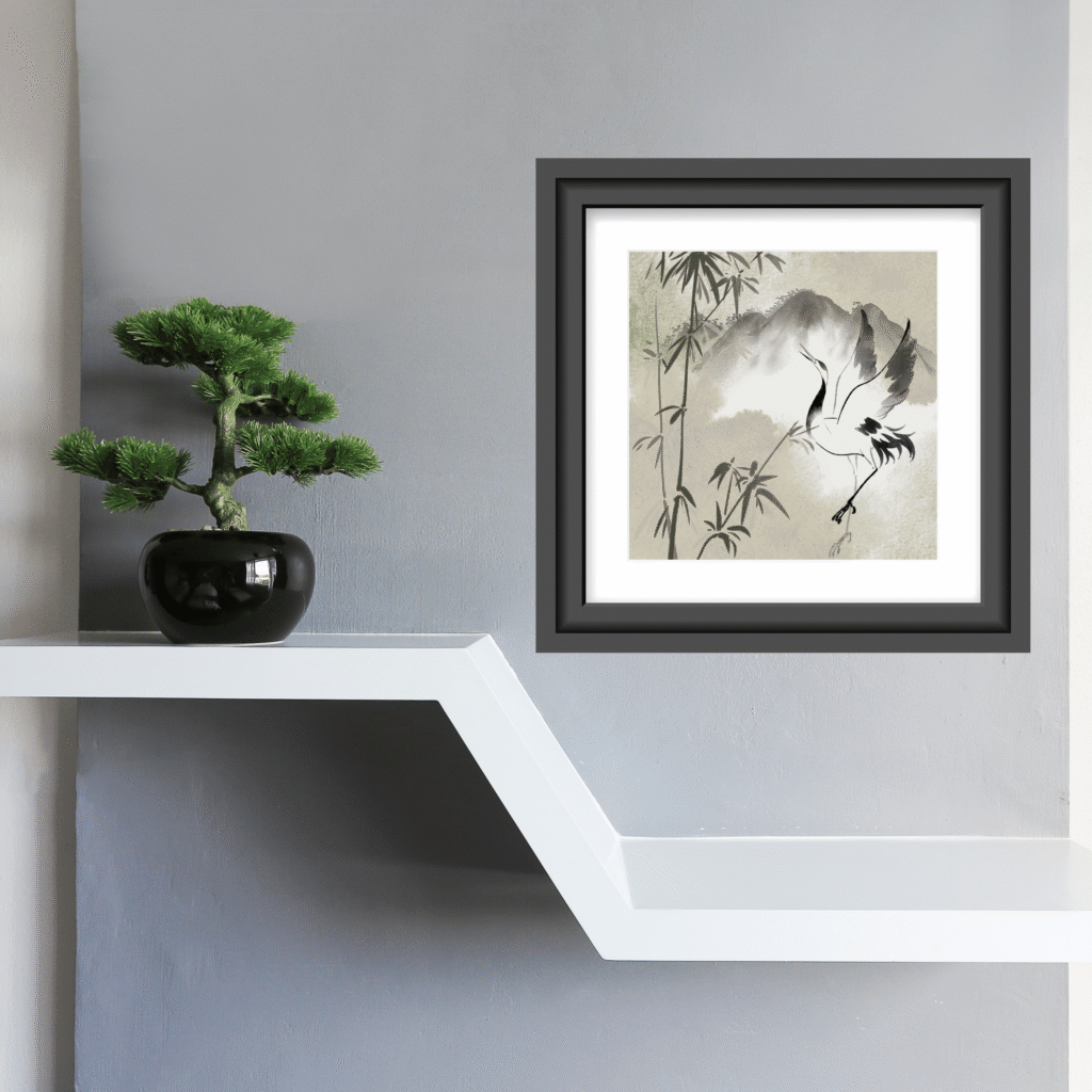
- Art Integration Tip: Avoid art with sharp lines or high contrast above the bed. Opt for a large-scale, Sumi-e style ink wash reproduction or a textured textile hanging in a single muted tone. The blurred, soft edges of ink wash painting mimic the soft focus of drowsiness and dreaming.
2. The Living Room: The Domain of Earth and Wood
- Philosophy: This is where we gather, converse, and ground ourselves after a day out in the world. The energy should be stable, warm, and welcoming. This is the true home of the Earth element.
- Primary Color Action: Walls in Warm Clay, Greige, or Sand. These colors are psychologically “hugging.” They do not recede like blue; they hold the space and make it feel safe.
- Art Integration Tip: This is the correct room for a Tokonoma (traditional Japanese alcove) inspired moment. Designate one wall or one corner as a seasonal focal point. Display a single, sculptural branch in a heavy ceramic vase. Rotate this object with the seasons (a blooming branch in spring, a bare branch in winter, a single dried leaf in autumn). This ritual connects you to the passage of time (mono no aware)—the gentle sadness of transience—which is a profound source of calm.
3. The Home Office: The Domain of Soft Wood
- Philosophy: You need clarity and focus without anxiety. This is a delicate balance of Wood (growth, mental activity) and Water (calm flow, preventing burnout).
- Primary Color Action: Walls in Sage Green or Celadon. Green is the color of balance in the center of the spectrum. It reduces eye strain from screens while keeping the mind alert but not agitated.
- Art Integration Tip: Keep the desk surface rigorously clear (Yohaku). A single Celadon glaze cup to hold a few pens is enough. The visual of the smooth, subtly crackled glaze (crazing) provides a micro-dose of wabi-sabi texture during stressful work moments. It is a visual anchor of quiet competence.
4. The Bathroom: The Domain of Pure Water and Metal Balance
- Philosophy: Bathrooms are already heavy with the Water element (plumbing, steam, flow). Adding more cool blue or gray creates stagnant, damp energy. You must add Earth and Wood to balance the element.
- Primary Color Action: Avoid cool blue or gray tiles. Instead, lean into warm, sandy plasters, clay-toned paint, or wood-look porcelain tile.
- Art Integration Tip: Wood elements are essential in a bathroom. A simple teak stool or a small bamboo plant in a ceramic pot does more for the energy of the room than any new towel color. Wood feeds on Water in the creative cycle of the elements; it keeps the energy moving upward and outward rather than stagnating.
Part VI: Diagnosing a Room That Isn’t Calm (Case Study)
Let’s apply this logic to a very common scenario.
The Scenario:
You painted your living room a supposedly “calm” pale gray. You bought the neutral beige sofa. The rug is a soft gray and white geometric pattern. Yet every time you sit in the room, you feel subtly tense. Your shoulders don’t drop. You keep fidgeting with the remote. Why?
The Diagnosis:
- The Gray is Synthetic: It is a cool gray with a blue-violet undertone (a harsh Metal/Water imbalance). It reflects cold light and feels like a hospital waiting room rather than a Zen retreat.
- Lack of Earth Element: The sofa is beige. The rug is gray and white. The coffee table is glass and polished steel. There is zero Wood (warmth, grain) or Earth (stability, texture) to anchor the energy. The room is floating.
- No Ma (Pause): The glass coffee table is covered in coasters, three remotes, a stack of unread magazines, and a candle.
The 15-Minute Prescription:
- Swap the Rug: Remove the high-contrast geometric rug. Replace it with a solid jute or sisal natural fiber rug (Earth texture). This instantly grounds the room.
- Introduce Wood: Place a single, rough-hewn wooden bowl or a piece of driftwood on the coffee table. Do not fill it.
- Clear the Table: Remove everything else from the table surface. Place only the wooden bowl and one small, smooth dark stone inside it.
- The Result: The stone and bowl provide a visual and energetic anchor. The empty glass surface provides Ma. The room’s energy shifts from “cluttered waiting room” to “curated gallery” with almost zero financial cost. The eye finally has a place to rest.

Part VII: A Material Glossary (Colors You Can Touch)
Understanding the source of color helps you make better, longer-lasting choices for your home. Here are specific East Asian materials that serve as perfect color references and decor accents.
- Celadon (Qingci / Seiji): A ceramic glaze color ranging from pale, icy blue-green to a deep, olive-jade tone. It mimics the color of precious jade. Modern Decor Application: Look for this color in ceramic table lamps, small vases, or even a single velvet throw pillow. It is the single most versatile and universally flattering calm accent color.
- Indigo (Aizome): A deep, living blue derived from plants. Unlike synthetic navy, natural indigo has a slightly red/purple base that softens its intensity. It fades beautifully with washing and age, developing a wabi-sabi patina. Modern Decor Application: Use sparingly. A single lumbar pillow or a framed piece of Shibori (tie-dye) fabric on an otherwise empty wall is enough. Too much indigo becomes heavy.
- Unbleached Linen / Ramie: The color of raw, unprocessed plant fiber. It is a warm, slightly nubby, and textural ecru. Modern Decor Application: Use this material for your primary window treatments. Linen curtains diffuse harsh, direct sunlight into a warm, enveloping glow that changes throughout the day. This is living color.
- Cast Iron / Blackened Steel: The color of a Tetsubin (Japanese cast iron tea kettle). It is not a shiny, reflective black. It is a matte, almost velvety dark gray with a subtle brown undertone from the iron oxide. Modern Decor Application: Swap out shiny chrome cabinet hardware or light switch plates for matte black or iron pulls. This small, inexpensive change removes the sharp, cutting energy of polished Metal from a room instantly.
Part VIII: Conclusion: The Space That Breathes
Calm is not found in a specific paint code number printed on a swatch at the hardware store. It is found in the relationship between a muted wall and an empty corner. It is found in the tension between the natural wood grain of a table and the soft morning light filtered through linen.
The goal is not to strip the room of personality. The goal is to strip the room of noise.
Decorate less. Choose pigments that look like soil, stone, and old paper. Leave generous, intentional space for your eye—and your mind—to rest. Integrate one piece of art or one vessel that holds the weight of history and imperfection.
That is how you create a home that finally breathes.