
Table of Contents
In the world of modern interior design, pastel colors are making a serene yet powerful statement. No longer confined to nurseries or springtime motifs, pastels have evolved into a sophisticated palette that aligns seamlessly with contemporary aesthetics. Especially when paired with structural inspirations from architecture and the precise folds of origami, pastels can create interiors that feel both ethereal and intelligently designed.
In this blog post, we’ll explore how to style pastel colors to craft a light and airy room, using principles of modern design, architectural influence, and origami artistry. Whether you’re an interior designer seeking inspiration or a homeowner looking to revamp your space, this guide will show you how to blend softness with structure for a harmonious and modern look.
Understanding Pastels: Softness as a Statement for a Light and Airy Room
Pastels are colors with high value (lightness) and low saturation, creating soft, soothing tones such as blush pink, mint green, baby blue, and lavender. These colors can make a room feel brighter and more expansive by reflecting natural light and creating a calm, open atmosphere.
In modern interiors, pastels are used not just for their emotional resonance but also for their versatility. They provide a backdrop that allows architectural lines and design elements to shine while contributing to a gentle and welcoming ambiance.
The Influence of Architecture: Structure Meets Subtlety
Modern architecture emphasizes clean lines, open spaces, and the use of natural light. When integrating pastels into such a space, the goal is to enhance these architectural features rather than overwhelm them.
Here are a few architectural principles that can inform your pastel design choices:
1. Minimalism and Negative Space
Pastels thrive in minimalist environments where negative space allows them to breathe. A white or light-gray background can amplify pastel accents, making the room feel uncluttered and expansive.
2. Geometric Harmony
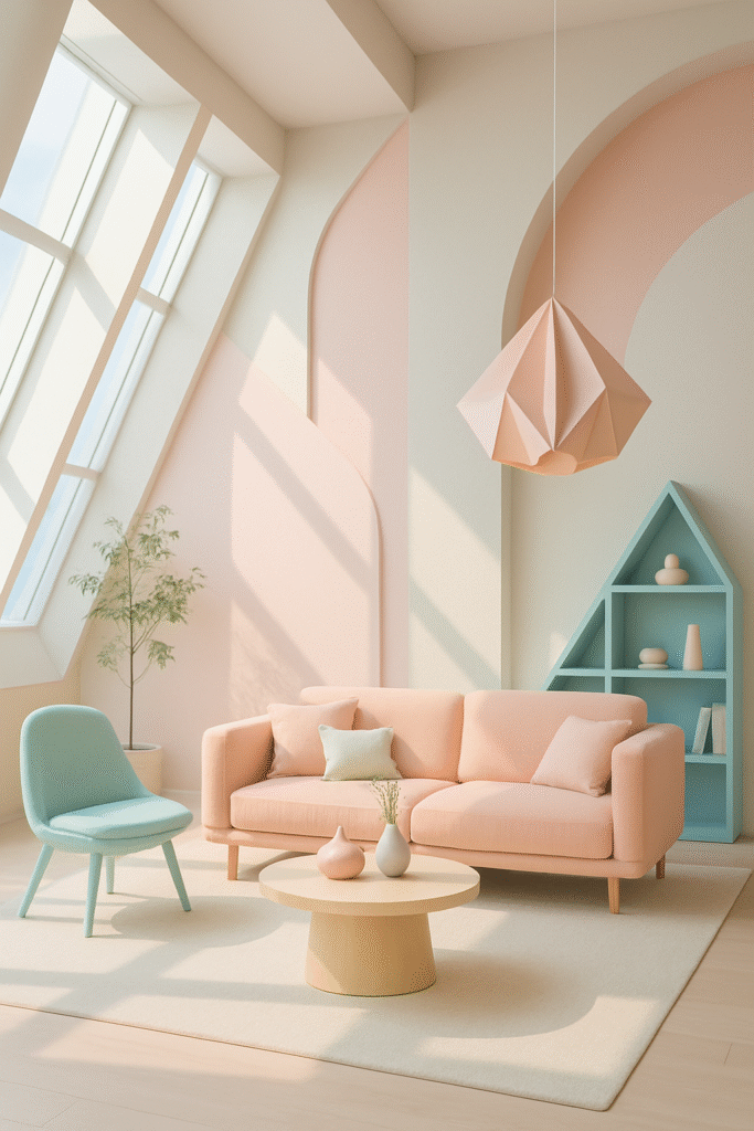
Architectural spaces often play with geometric forms—arches, straight lines, and modular layouts. Use pastel tones to highlight these shapes. For instance, a pastel wall inset within a geometric alcove or a pastel-toned cube shelving unit can create visual rhythm.
3. Material Contrast
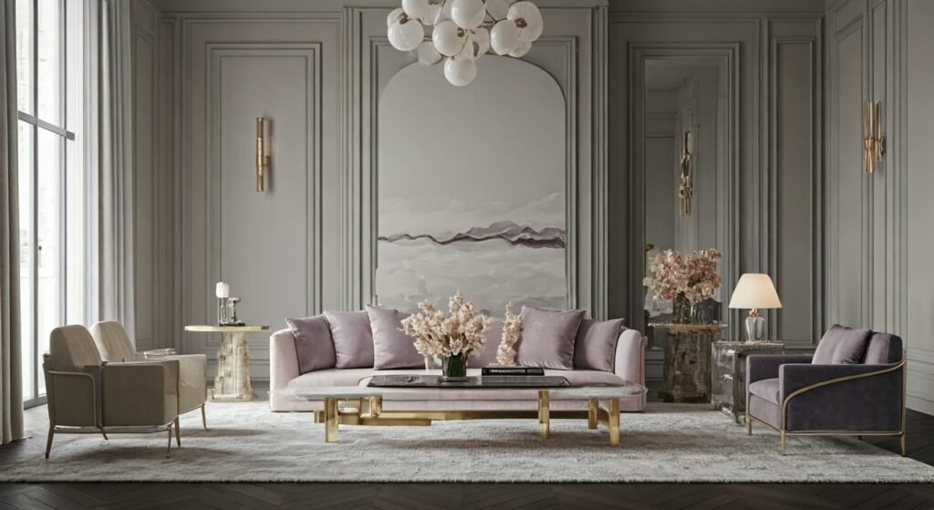
Pair pastels with raw architectural materials like concrete, steel, or wood. A blush pink sofa against a concrete wall or a mint green chair beside a raw wood table creates an engaging juxtaposition between soft color and hard texture.
Origami as Inspiration: The Art of Folded Precision
Origami offers a unique perspective on form, shadow, and dimension. Translating these qualities into interior design can elevate a pastel space from simple to sculptural.
1. Fold-Inspired Fixtures and Furnishings
Think pendant lights that mimic paper lantern folds, wall art with dimensional paper structures, or furniture with faceted surfaces that echo the pleats of origami. Choose pastel tones for these pieces to emphasize their delicate, architectural qualities.
2. Sculptural Wall Treatments
Use pastel-colored wall panels or wallpaper with origami-inspired reliefs. These treatments can add texture and shadow play while maintaining a soft and calming visual presence.
3. Layering and Repetition
Origami relies on repetition and symmetry. Incorporate these principles through repeated pastel-colored tiles, modular shelving units, or fabric patterns that mimic folded motifs. This structural repetition helps ground the softness of pastel colors in design rigor.
Creating a Light and Airy Palette
When crafting a pastel-based palette for a room, it’s crucial to balance the colors and ensure that the light, airy effect remains intact. Here’s how:
1. Stick to a Muted Base
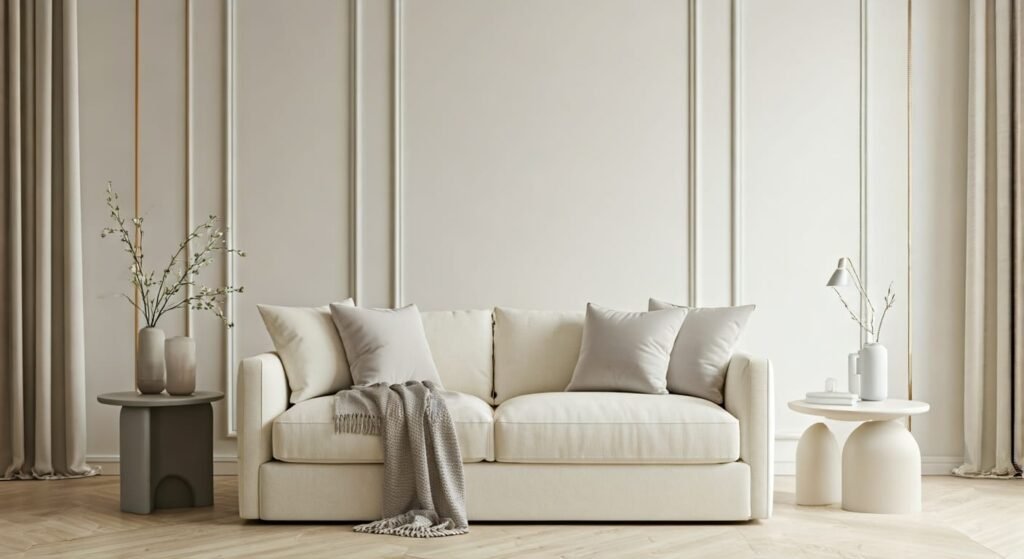
Begin with a base of white, off-white, or light gray. This creates a clean canvas and enhances the brightness of pastel tones. A muted base also ensures that pastels don’t clash or become too saccharine.
2. Choose a Hero Pastel
Select one pastel shade as your main color—this could be a dusty rose wall, a seafoam green sofa, or a sky-blue rug. This hero color will guide the rest of your selections and anchor the room’s palette.
3. Add Supporting Pastels Sparingly
Introduce one or two additional pastel accents in smaller amounts—think throw pillows, artwork, or vases. This approach creates visual interest without overwhelming the space.
4. Mix with Neutrals and Metallics
Incorporate neutral materials such as linen, jute, and wood to ground your pastels. Metallic accents in gold, brass, or chrome can add sophistication and contrast.
Room-by-Room Styling Guide
Living Room
- Hero Piece: A pastel velvet sofa in blush or sage.
- Structural Accent: Origami-inspired wall sconces or pendant lamps.
- Textiles: Throw pillows in varying pastel tones, paired with a neutral woven rug.
- Furniture: Clean-lined wooden or metal tables with pastel finishes.
Bedroom
- Walls: Soft lavender or pale peach paint with white trim.
- Bedding: Layered pastel linens—light blue sheets with a dusty pink duvet.
- Lighting: Folded-paper-inspired bedside lamps in subtle hues.
- Decor: Wall art featuring geometric or origami patterns.
Kitchen
- Cabinetry: Matte pastel cabinets in mint or powder blue.
- Backsplash: Tiled in a herringbone or scallop pattern using soft pastels.
- Accessories: Pastel-colored ceramics, utensils, and textiles.
Bathroom
- Tiles: Glossy pastel tiles paired with white or light gray.
- Fixtures: Chrome or brass fixtures for a modern touch.
- Storage: Open shelving with pastel organizers and towels.
Lighting and Atmosphere
Lighting is crucial in maintaining the airy quality of a pastel room. Use a combination of natural and artificial lighting to ensure that colors remain true and vibrant.
- Natural Light: Maximize with sheer curtains or open windows.
- Ambient Light: Use soft, warm-toned LED bulbs.
- Accent Light: Highlight architectural and origami-inspired features with focused lighting.
Art and Accessories: Final Touches
The final layer of styling comes with art and accessories. Select pieces that resonate with the structural elegance of origami and the clarity of architectural design.
- Wall Art: Abstract pastels with geometric lines or textured paper collages.
- Sculptures: Small folded paper or ceramic sculptures in pastel shades.
- Plants: Greenery in soft pastel pots for a fresh touch.
Common Mistakes to Avoid
- Overusing Pastels: Too many pastels can create a washed-out look. Balance is key.
- Neglecting Contrast: Always include contrasting textures or darker tones.
- Clashing Styles: Stick to one coherent design language—don’t mix rustic farmhouse with sleek modernism if your palette is pastel and geometric.
Conclusion: The Elegance of Airy Structure

When styled thoughtfully, pastel colors can transform a room into a sanctuary of light and structure. By drawing on the clean lines of architecture and the sculptural inspiration of origami, you can create spaces that are soft yet dynamic, calm yet intellectually engaging. Pastels are no longer just about whimsy—they’re about precision, elegance, and design maturity.
Whether you’re renovating an entire space or simply looking to introduce a breath of fresh color, pastel tones offer endless possibilities for styling a room that feels as airy as it is architecturally inspired. Embrace the art of gentle color and structural beauty—and let your space bloom in subtle sophistication.