
Table of Contents
Interior designers call throw pillows the “jewelry of the room” for good reason. The right arrangement transforms a sofa from functional to inviting and creating that curated look is about understanding a few key principles.
The average person spends 7-8 hours a day in their living room. Yet most approach pillow arrangement haphazardly—buying one-off pieces that don’t work together, or sticking with the pillows that came with the sofa. This guide changes that by helping you create professional-looking arrangements with pillows you already own, plus know exactly what to look for when adding new pieces.
This guide draws from soft artistic minimalism and East Asian design philosophy, where beauty emerges from restraint, balance, and intention. These seven strategies will help you mix patterns and colors with confidence.
1. Start with the Rule of Three (Sizes and Textures)
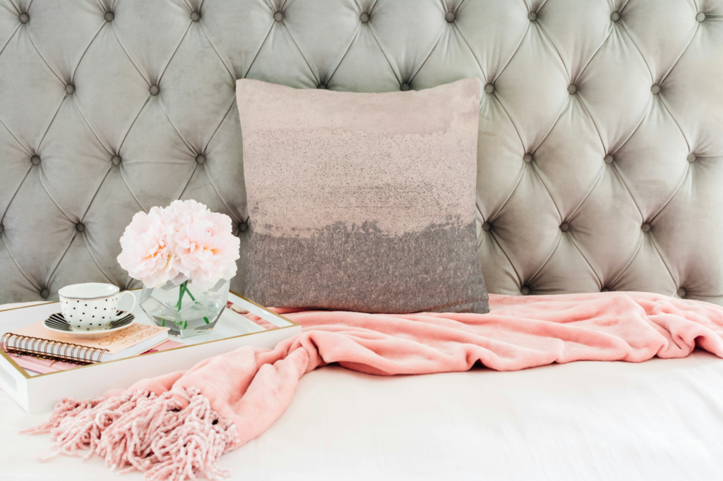
Vary your pillow sizes to create visual rhythm. On a standard sofa, try two 22-inch throw pillows in back, two 20-inch in front, and a 16-inch lumbar pillow in the center.
Don’t stop at size—texture adds crucial depth. Combine smooth linen with nubby boucle, or pair flat cotton prints with dimensional embroidery. Different surfaces catch light throughout the day, adding subtle movement to your space.
For a living room in neutrals, try this: one smooth ivory linen, one textured oatmeal boucle, one flat-weave geometric in charcoal and cream. The variety creates interest while the neutral palette keeps it cohesive.
Leave breathing room between pillows. Negative space separates a curated look from a cluttered one.
How to Apply This:
Start by measuring your current throw pillows. Most decorative pillows are 18-22 inches square. Add variety by introducing at least one pillow that’s 2-4 inches larger or smaller than your others. Include one lumbar pillow (typically 12×20 or 12×24 inches) for visual variety.
Common Mistakes to Avoid:
- Buying all throw pillows the same size—this creates a flat, uninspired look
- Choosing textures that are too similar—velvet on velvet lacks contrast
- Overcrowding your sofa—if you remove pillows every time you sit, you have too many
2. The 60-30-10 Color Rule
Use this designer formula for balanced color schemes: 60% dominant color, 30% secondary color, 10% accent.
Start by identifying your room’s existing palette. Your dominant pillow color (60%) should echo your largest furniture piece or wall color. Your secondary color (30%) might pull from artwork or plants in the room. Your accent color (10%) is where you add a pop of contrast.
Echo colors, don’t match them. If your sofa is charcoal, choose pillows in harmonizing shades rather than the exact same tone. This creates cohesion without monotony.
How to Apply the 60-30-10 Rule:
Look at your sofa. Count your throw pillows. If you have five pillows, three should be your dominant color, one to two should be secondary, and one should be your accent. For six pillows, aim for three to four dominant, two secondary, and one accent. Adjust the exact numbers based on pillow size—a large 24-inch pillow carries more visual weight than a small 16-inch one.
Real-World Example:
Your living room has a beige sofa, navy curtains, and coral artwork. Use three beige or cream pillows (60%), one to two navy pillows (30%), and one coral pillow (10%). The beige grounds the arrangement, the navy creates cohesion with the window treatments, and the coral ties to your art.
Common Mistakes to Avoid:
- Using equal amounts of each color—this creates visual confusion
- Matching pillow colors exactly to one piece of furniture—echo instead
- Forgetting to pull accent colors from existing room elements
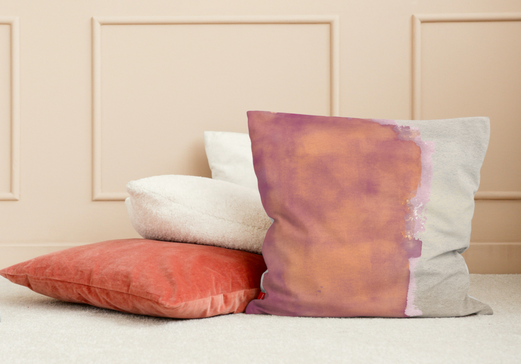
3. Balance Bold Patterns with Solid Anchors
Every successful arrangement needs visual rest areas. Limit yourself to two bold patterns, then ground them with solid pillows in complementary colors.
This reflects the Japanese principle of ma, or negative space—what you leave out matters as much as what you include. A bold geometric becomes more striking when flanked by muted solids. The pattern gets to shine while the solids provide calm.
Think of solids as the quiet spaces in a conversation. They give patterns room to breathe and prevent your arrangement from feeling chaotic.
How to Apply This:
If you have five pillows, try this formula: two solid pillows in your dominant color, one bold pattern, one subtle pattern or texture, one solid in your accent color. The two patterns should differ in scale or style—perhaps one geometric and one organic.
Pattern Pairing Examples:
- Large-scale floral + small dotted texture
- Bold stripe + subtle wave pattern
- Abstract brushstroke + delicate line drawing
- Oversized geometric + fine herringbone
Common Mistakes to Avoid:
- Using three or more bold patterns—the eye doesn’t know where to focus
- Choosing patterns that are too similar in style and scale—they compete rather than complement
- Forgetting to include any solid pillows at all
4. Mix Pattern Scales Thoughtfully
When combining patterns, vary their scale. Two large-scale prints compete for attention, but a large botanical paired with a small geometric creates interest.
Patterns should be different but related. Combine oversized abstract brushstrokes with delicate line drawings, or pair wide stripes with tiny dots. Varying scales give your eye a journey without creating discord.
Choose patterns that share a common element—all nature-inspired, or all featuring curved lines—but express that theme at different sizes. This creates unity with variety.
Understanding Pattern Scale:
- Large-scale: Pattern elements 4+ inches across (oversized florals, wide stripes, bold geometrics)
- Medium-scale: Pattern elements 1-3 inches (standard prints, moderate geometrics)
- Small-scale: Pattern elements under 1 inch (tiny dots, fine lines, subtle textures)
How to Apply This:
Start with one large-scale pattern as your statement piece. Add one medium or small-scale pattern that shares at least one color with the large pattern. Fill in with solids. The scale difference creates visual interest while the shared colors maintain harmony.
Successful Scale Combinations:
- Oversized palm leaves (large) + thin pinstripes (small) + solid
- Abstract watercolor wash (large) + small grid pattern (small) + solid
- Wide cabana stripes (large) + delicate floral (medium) + solid
Common Mistakes to Avoid:
- Pairing two large-scale patterns—they fight for dominance
- Using only small-scale patterns—the arrangement feels timid
- Mixing too many different scales—stick to two or three
5. Create a Color Story with Temperature
Color temperature matters. Hues with red, orange, or yellow undertones read as warm. Blue, green, or purple undertones feel cool.
Work monochromatically within one temperature for sophistication. An arrangement ranging from cream to terracotta to rust creates depth while maintaining serenity. Or try cool tones moving from pale gray to dusty blue to deep charcoal.
For more energy, build your arrangement in one temperature, then add a single accent in the opposite temperature. Warm beiges and soft corals get life from one cool sage pillow. Let one temperature dominate while the other supports.
Identifying Color Temperature:
Not sure if a color is warm or cool? Compare it to pure white. Colors that make white look slightly blue are warm (they have yellow/red undertones). Colors that make white look slightly cream or yellow are cool (they have blue undertones).
Warm Color Palette Examples:
- Cream, camel, terracotta, rust, warm gray
- Butter yellow, peach, coral, brick red
- Tan, cognac, burnt orange, chocolate brown
Cool Color Palette Examples:
- White, light gray, slate, charcoal, true black
- Ice blue, seafoam, sage, mint, emerald
- Lavender, dusty purple, navy, indigo
How to Apply This:
Choose your dominant temperature based on your room’s existing palette. If you have warm wood furniture and beige walls, lean into warm-toned pillows. If you have gray walls and chrome fixtures, cool tones work better. Add one opposite-temperature accent for contrast.
Common Mistakes to Avoid:
- Mixing equal amounts of warm and cool—pick one to dominate
- Ignoring your room’s existing temperature—pillows should harmonize with wall colors and furniture
- Assuming all neutrals work together—beige (warm) and gray (cool) can clash
6. Don’t Forget About Odd Numbers
Odd numbers feel dynamic. Three, five, or seven pillows create arrangements that feel natural and unforced.
For a standard sofa, five to seven pillows works well. A loveseat needs three to five. An accent chair takes one or three. Odd numbers create asymmetry that feels balanced.
Break this rule for formal, symmetrical looks. Two matching pillows flanking a central lumbar creates intentional symmetry that feels crisp.
Pillow Count by Furniture Type:
- Three-seat sofa (7-8 feet): 5-7 pillows
- Two-seat loveseat (5-6 feet): 3-5 pillows
- Sectional sofa: 7-9 pillows (odd numbers per section)
- Accent chair: 1-2 pillows (one statement or two small)
- Bench or settee: 2-3 pillows
How to Apply This:
Start with the minimum odd number for your furniture type. Add pillows until the arrangement feels full but not crowded. You should still have comfortable seating space. Remove one pillow if the arrangement feels overwhelming.
When to Use Even Numbers:
Symmetrical bedroom arrangements on beds work well with even numbers—two Euro shams plus two standard shams creates intentional balance. Formal living rooms with matching chairs on either side of a sofa can mirror even-numbered arrangements.
Common Mistakes to Avoid:
- Defaulting to four pillows on every sofa—it’s the most common but often feels incomplete
- Adding so many pillows you can’t sit comfortably
- Assuming odd numbers mean chaotic placement—arrangements should still feel balanced
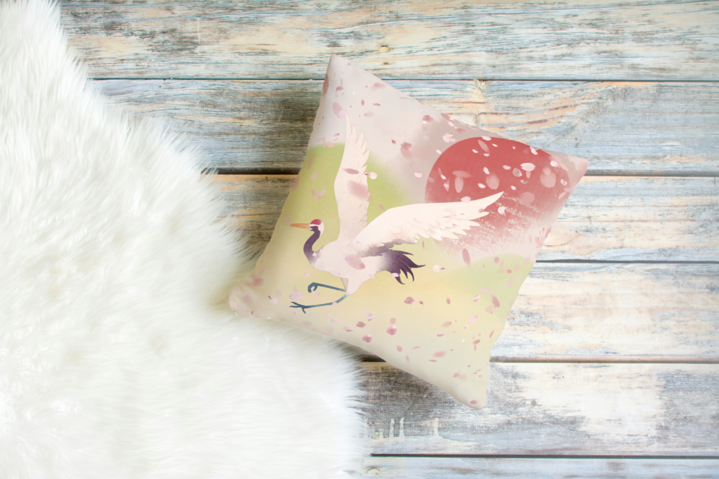
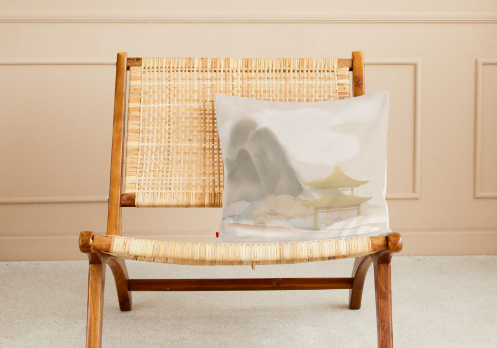
7. Layer Meaning with Cultural and Artistic Elements
Choose pillows that tell stories. Think beyond aesthetics to what designs represent and how they make you feel.
East Asian-inspired designs often carry deeper meaning. Bamboo represents resilience and flexibility. Cherry blossoms suggest the beauty of impermanence. Abstract brushstrokes evoke the spontaneity of traditional ink painting, where each mark is both deliberate and free.
Mix modern minimalism with traditional motifs. The most interesting rooms combine different design languages in conversation with each other.
Design Elements and Their Meanings:
- Bamboo: Strength, flexibility, growth
- Cherry blossoms: Beauty in transience, renewal
- Waves: Flow, persistence, natural rhythm
- Mountains: Stability, perspective, permanence
- Cranes: Longevity, peace, good fortune
- Lotus: Purity, enlightenment, rebirth
How to Apply This:
Consider what qualities you want your space to evoke. Seeking calm? Choose soft brushstroke patterns or nature motifs. Want energy? Opt for bold geometric designs. Creating a reading nook? Select throw pillows with quieter, contemplative designs.
Mixing Cultural Influences:
Don’t feel constrained to one design tradition. A Scandinavian minimalist sofa can beautifully host pillows with Japanese-inspired botanical prints. Mid-century modern furniture pairs well with abstract patterns influenced by East Asian calligraphy. The key is finding common ground—perhaps a shared color palette or similar level of visual complexity.
Common Mistakes to Avoid:
- Choosing designs solely because they’re trendy—pick pieces that resonate with you
- Mixing too many competing cultural aesthetics without a unifying element
- Overlooking the emotional impact of the patterns you live with daily
For more information about East Asian-inspired and Japanese interior styling, check out Japanese-Inspired Home Decor: 7 Ways to Create a Zen Space with Soft Minimalist Artwork.
Refreshing Your Arrangement Seasonally
Pillows offer an easy way to shift your space with the seasons. You don’t need to buy entirely new sets—even changing out two accent pillows can refresh the whole arrangement.
Spring: Transition to lighter fabrics like linen and cotton. Introduce softer colors—blush, sage, soft yellow. Consider patterns with botanical elements or delicate florals.
Summer: Keep fabrics light and breathable. Lean into cooler colors—blues, greens, crisp whites. Coastal-inspired patterns and stripes feel appropriate.
Fall: Introduce warmer textures like boucle, chenille, or wool blends. Shift to richer colors—rust, deep greens, warm browns. Consider patterns with organic, earthy elements.
Winter: Bring in plush fabrics like velvet or faux fur. Use deeper jewel tones—navy, emerald, burgundy. Heavier textures create coziness.
The Capsule Approach:
Create a core collection of four neutral pillows in varying sizes and textures. These stay year-round. Then maintain two to three seasonal accent pillows that you rotate. This approach is economical and prevents storage overwhelm.
Adapting These Rules by Room
Different rooms call for different approaches. Adjust your pillow strategy based on how you use each space.
Living Room
This is your showcase space. Go bolder here with patterns and colors. Five to seven pillows with two patterns works well. This room can handle more visual complexity because you’re not trying to sleep in it.
Bedroom
Keep it calmer. Stick to three to five pillows maximum on the bed, and lean toward solids or subtle patterns. Your bedroom should promote rest, not visual stimulation. If you use decorative pillows, make sure they’re easy to remove at night—you don’t want a nightly choreography routine.
Reading Nook or Accent Chair
One statement pillow is often enough. Choose comfort over abundance. A single 20-22 inch pillow in a fabric you love to touch provides both back support and visual interest without overwhelming a small chair.
Guest Room
Opt for mid-range visual interest—more exciting than your bedroom but less complex than your living room. Three to four pillows in a simple color story with one subtle pattern makes guests feel welcomed without overwhelming them.
Outdoor Spaces
Use weather-resistant fabrics, but apply the same design principles. Outdoor pillows can be bolder and more playful—patios and decks are casual spaces. Just remember that bright sunlight will fade colors faster, so consider this when investing in expensive pieces.
Three Complete Arrangements to Try
Sometimes seeing the full picture helps more than understanding individual rules. Here are three complete arrangements you can recreate or use as inspiration.
Coastal Calm (for a standard sofa)
- Two 22-inch pillows in sandy beige linen (back corners)
- Two 20-inch pillows in soft blue-gray with subtle wave pattern (front)
- One 12×20-inch lumbar in cream with thin navy stripes (center)
This arrangement uses the 60-30-10 rule (beige 40%, blue-gray 40%, navy 20%), varies textures, incorporates one bold pattern with solids, and uses odd numbers.
Minimalist Organic (for a sectional)
- Two 22-inch pillows in charcoal linen (back)
- Two 18-inch pillows in warm taupe boucle (middle)
- One 20-inch pillow featuring abstract brushstroke in black on cream (front)
- Two 16-inch pillows in soft gray (sectional side)
This seven-pillow arrangement works monochromatically in cool neutrals, relies heavily on texture variation, uses one statement pattern, and distributes pillows asymmetrically across the sectional.
Warm Bohemian (for a loveseat)
- Two 22-inch pillows in terracotta solid (back)
- One 20-inch pillow with large-scale botanical in rust and cream (front left)
- One 18-inch pillow in cream with small geometric detail (front right)
- One 12×20-inch lumbar in deep rust (center)
This five-pillow arrangement lives entirely in warm tones, uses two patterns at different scales, anchors with solid pillows, and creates visual interest through size variation.
Common Questions About Mixing Pillows
How many pillows is too many?
If you need to remove pillows every time you sit down, you have too many. Pillows should enhance comfort and aesthetics, not create obstacles. A good test: sit on your sofa with all pillows in place. If it’s uncomfortable, remove pillows until you can relax.
Should my pillows match my curtains?
No. They should coordinate with your overall palette but matching creates a dated, overly coordinated look. Instead, pull one color from your curtains and use it as an accent in your pillow arrangement. This creates cohesion without looking matchy.
What’s the best pillow fill?
Down alternative (polyester fiber) keeps its shape better than standard polyester and is hypoallergenic. Down is the softest and most luxurious but requires regular fluffing and is more expensive. Avoid cheap polyester fills that clump and flatten quickly—they make even beautiful pillow covers look sad.
How do I clean decorative pillows?
Check care labels, but most pillow covers can be spot-cleaned or gently hand-washed. Remove inserts before washing covers. Air dry to prevent shrinkage. Some fabrics like linen and cotton can handle machine washing on gentle cycles, but always zip or button covers closed first.
Can I mix different design styles?
Yes, but use a unifying element. Mix modern and traditional patterns through a shared color palette. Combine different cultural influences if they share similar visual weight or complexity. The key is intention—random mixing looks haphazard, but thoughtful mixing looks curated.
Should I buy pillows with inserts or separate covers?
Buy covers and inserts separately when possible. This allows you to choose quality inserts (get ones 2 inches larger than the cover for a plump look) and easily switch covers seasonally. Pre-filled pillows are fine but limit your flexibility.
How often should I replace throw pillows?
Quality pillows with good inserts can last years. Replace covers when you’re ready for a style change or if they’re damaged. Replace inserts when they no longer spring back after compression—usually every 2-3 years for daily-use pillows.
What if I’m working with a colorful or patterned sofa?
Let the sofa be the star. Use mostly solid pillows in colors pulled from the sofa pattern. Add one subtle pattern that doesn’t compete with the sofa’s design. The pillows should complement, not overwhelm.
Bringing It All Together
Mixing throw pillows is about balance, not perfection. Start with these principles, but trust your eye. If an arrangement makes you feel calm or happy when you walk into the room, you’ve succeeded.
Your home is a living space. Pillow arrangements should evolve with the seasons, your mood, or new pieces in the room. Experiment. Move things around. Try unexpected combinations. Take a photo of your arrangement, live with it for a few days, and adjust what isn’t working.
The most important rule: choose pieces that make you want to sit down and stay awhile. Beautiful design serves comfort, not the other way around.
Your home deserves to be a sanctuary. Sometimes it starts with something as simple as the right pillow.
Quick Reference Guide
- Vary sizes: Use 3+ different dimensions
- Color ratio: 60% dominant, 30% secondary, 10% accent
- Pattern limit: Maximum 2 bold patterns per arrangement
- Mix scales: Combine large, medium, and small-scale prints
- Temperature: Work within one, or use contrast intentionally
- Odd numbers: 3, 5, or 7 pillows for dynamic arrangements
- Layer meaning: Choose designs that resonate personally
- Seasonal refresh: Swap 2-3 accent pillows each season
- Room-specific: Adjust quantity and boldness by space
- Comfort first: Remove pillows if seating becomes uncomfortable