
Table of Contents
As summer arrives with its golden light and extended days, our living spaces crave the same energy: openness, vibrancy, and warmth. Interior design this season is all about striking a harmonious balance between color and structure. For homeowners and designers alike, there’s an increasing trend toward integrating artful geometry and expressive summer color palettes that honor both emotion and order.
Enter the fusion of modern architecture, structural minimalism, and the delicate precision of origami. These design influences guide us toward a summer aesthetic that is bright yet balanced—bringing shape, depth, and joy into modern interiors.
A Season of Intentional Contrast
Color trends are never just about surface-level beauty. They respond to the cultural moment, reflecting deeper emotional and societal shifts. In 2025, we see a growing desire for balance: the need for mental clarity, playful expression, and visual harmony. This plays out beautifully in the season’s trending hues, which juxtapose energy with calm, boldness with restraint.
Architecture gives us the clean lines and spacious logic that our minds crave. Origami, as both a material and conceptual influence, adds dimension through layering, folding, and transformation. Together, they provide the perfect foundation for a summer color palette that’s alive yet grounded.
Let’s explore how these themes unfold in today’s leading color directions.
1. Sunrise Coral & Soft Terracotta: Earthy Warmth with a Sculptural Twist
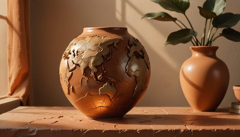
As the sun rises earlier each day, our interiors echo that warmth through hues of coral, terracotta, and dusky rose. These shades evoke the earthy textures of clay, brick, and sunlit canyons—materials closely tied to human craft and organic architecture.
In structural design, terracotta surfaces are prized for their tactile quality. Similarly, origami art often embraces warm colors to highlight folds and shadows. This season, sunrise coral offers a cheerful yet sophisticated nod to nature’s palette, while soft terracotta remains a steadying influence in open-plan interiors.
How to Use It:
- Accent walls in coral can invigorate a room without overwhelming it.
- Terracotta tiles or fabric accessories ground modern furniture in natural texture.
- Combine with soft neutrals and sculptural elements like folded paper wall decor or angular vases.
Ideal Rooms: Living rooms, dining nooks, and transitional spaces where warmth welcomes and light flows.
2. Mist Blue & Steel Gray: Calm Precision for Modern Spaces
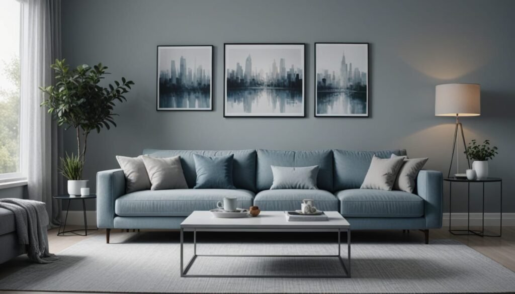
Drawing from both the clarity of the summer sky and the sleekness of industrial materials, mist blue and steel gray bring a refreshing sense of stillness. These hues embody the quiet power of well-structured environments. Think of architectural renderings and the subtle gradients of folded aluminum—understated but exacting.
When inspired by origami, mist blue becomes more than a soft pastel; it takes on the serenity of folded fabric or flowing silk. Steel gray, meanwhile, carries weight and sophistication, anchoring lighter colors with clean edges and a modernist spirit.
How to Use It:
- Layer shades of gray and blue in upholstery and modular seating.
- Use steel gray for cabinetry or structural shelving.
- Display geometric artwork or origami-inspired wall sculptures to introduce form.
Ideal Rooms: Home offices, bedrooms, and media rooms where focus and peace are paramount.
3. Chartreuse & Lemon Zest: A Bright Pulse of Creative Energy
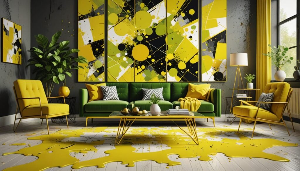
If summer had a sound, it would be a laugh in the park or the clink of ice in a glass. Chartreuse and lemon zest capture that same sense of spontaneous joy. These bold, bright shades energize modern spaces and play beautifully off crisp white architecture and folded design elements.
In the context of origami and geometric sculpture, chartreuse and lemon zest act as highlight tones. They emphasize motion, catch the eye, and offer contrast against softer backgrounds. They’re especially effective when used to draw attention to the shape of an object or feature in the room.
How to Use It:
- Paint small architectural features (niches, beams, cabinet insets) in bold yellow tones.
- Introduce statement pieces like modular origami wall panels in chartreuse.
- Pair with white walls, soft grays, or natural wood to balance the brightness.
Ideal Rooms: Kitchens, entryways, children’s play areas, or creative studios that benefit from high energy and playfulness.
4. Dusty Lilac & Lavender Fog: Delicate Complexity
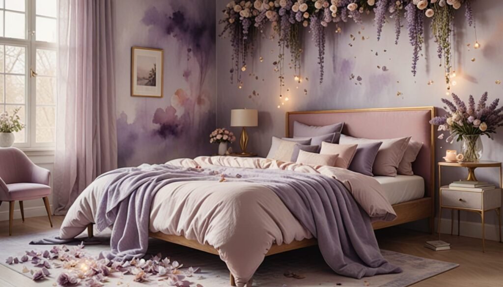
Muted purple tones offer a poetic counterbalance to the season’s bold colors. Dusty lilac and lavender fog evoke softness and depth—almost like shadows on silk. These tones introduce emotional nuance and a gentle feminine edge to otherwise structured, minimal interiors.
Architecturally, these shades play with shadow and light, offering a kind of visual whisper. In origami, these colors transform the material into something ethereal, especially when used in layered or modular designs.
How to Use It:
- Upholster accent furniture in lavender fog for a subtle sophistication.
- Add dusty lilac in textiles like curtains or pillows to create tonal depth.
- Incorporate sculptural lighting in these hues to create ambiance through shadow play.
Ideal Rooms: Reading rooms, bedrooms, and meditation spaces where emotional comfort is essential.
5. White on White: Negative Space as Intentional Design
A clean, all-white palette remains a summer favorite, but this year it comes with added dimensionality. White on white doesn’t mean sterile—it means mindful. Variations in tone, texture, and material create layers of interest while maintaining a sense of calm and order.
This approach draws deeply from origami, where light and shadow animate a single color. In architectural terms, white walls become blank canvases for form: folded installations, sculptural furniture, and creative lighting take center stage.
How to Use It:
- Layer matte and glossy whites for dynamic texture.
- Use folded paper artwork, white ceramics, or 3D wall panels to build depth.
- Choose sculptural furniture in neutral tones to maintain a cohesive feel.
Ideal Rooms: Art galleries, modern kitchens, and minimalist living rooms that celebrate simplicity and space.
Origami-Inspired Design as a Foundation for Color
Origami isn’t just a decorative theme; it’s a design philosophy rooted in transformation and precision. The process of folding brings intention to form, and each crease is both functional and beautiful. In modern interiors, this idea manifests in modular design, 3D surfaces, and playful geometry.
Using summer’s color trends through the lens of origami means not only considering shade, but also shape:
- Folded Textiles: Curtains, rugs, and bedding with pleats or geometric folds add tactile interest.
- Sculptural Lighting: Pendant lamps shaped like paper lanterns or faceted domes bring artistic flair.
- Wall Art: Origami-inspired sculptures made from painted paper or fabric give dimension and storytelling to flat walls.
- Furniture: Designs that use folds, bends, or layering in their construction—especially in wood or molded plastic—bridge form and function beautifully.
By combining color with structure, rooms take on a balanced harmony. This is where modern design excels: in its ability to express creativity within thoughtful limits.
Making Summer Last: Styling Tips for Longevity
While summer brings inspiration, your interior choices can outlast the season. Here are a few ways to make these color trends work all year round:
- Layer Temporarily: Use removable wallpaper, throw pillows, or modular artwork in trending colors. These allow you to refresh your space seasonally without full renovation.
- Neutral Base, Color Accents: Start with a timeless foundation (white, gray, beige) and swap in brighter accents as desired.
- Art as Anchor: Invest in sculptural pieces or framed origami art that blend color with form—artwork doesn’t go out of style the way paint swatches might.
- Light and Material: Consider how light interacts with your chosen colors. Natural textures (wood, paper, stone) work well with both vibrant and subtle palettes.
The Takeaway: Brightness with Intent
This summer, decorating isn’t just about color or style—it’s about aligning your environment with how you want to feel. Do you want a space that energizes you in the morning? Or one that welcomes you home with calm and grace? Through architectural clarity, sculptural influence, and origami-inspired structure, the season’s color palette offers something for every emotional need.
Whether you’re renovating an entire room or simply updating accessories, choose hues that speak to your inner rhythm. Let color become a form of architectural storytelling. Let your space unfold like a well-folded sculpture—precise, expressive, and perfectly yours.
Looking to bring summer’s energy into your home?
Explore a curated collection of origami-inspired wall art, paper sculptures, and mixed media pieces designed to celebrate structure, emotion, and seasonal beauty. Bright and balanced has never looked this good.