
Table of Contents
Introduction: The Small Space Paradox
Living in a small apartment often feels like a constant negotiation. You are trading square footage for location, closet space for character, and a yard for a view of the city skyline. When it comes to decorating, the challenges multiply. How do you make a space feel personal without making it feel cluttered? How do you express your taste when every square inch of wall space feels precious?
Many people make a critical mistake when decorating small homes: they either leave the walls completely bare out of fear, or they fill them with small, mediocre pieces that create visual noise. Neither approach works.
This is where watercolor art enters the conversation.
Watercolor is not just another medium. In my experience, it is arguably the most forgiving and spatially intelligent art form you can choose for a compact living space. Its translucent washes, soft edges, and luminous qualities do not shout for attention; they whisper. They create depth without weight.
In this guide, I want to walk you through the process of selecting watercolor art for your small apartment. But I want to go deeper than just measurements and color swatches. I want to explore how ancient East Asian philosophies—specifically the concepts of Ma, Wabi-Sabi, and Shanshui—can transform your approach to decorating, turning your small apartment from a cramped box into a serene, expansive sanctuary.
By the end of this guide, you will know exactly how to choose, size, and place watercolor art to maximize both your space and your peace of mind.

The Philosophical Foundation: Why East Asian Thought Matters in Decorating
Before I discuss what size frame to buy or what color palette to choose, I believe we must address the mindset. Western interior design often focuses on “what” to add. East Asian aesthetics focus on “how” the space feels. To choose art wisely for a small apartment, I have found that you must adopt the latter perspective.
Concept 1: Ma (間) – The Power of the Space In-Between
In Japanese aesthetics, “Ma” is often translated as “interval” or “negative space.” However, I think this translation is too simplistic. Ma is not merely empty space; it is the conscious void that gives everything else meaning. It is the silence between the notes that makes the music, the empty part of the cup that holds the water, the unpainted section of the canvas that defines the mountain.
Why does this matter for your apartment?
In a cramped environment, the human eye and brain need places to rest. If every surface is covered and every wall is filled with busy patterns or dense imagery, your brain registers stress. You feel claustrophobic, even if the room is tidy.
Ma teaches us that space itself is a luxury. When you walk into a room, you should feel the air moving, not just the objects occupying it.
How does this connect to watercolor?
I have always believed that great watercolor art is a masterclass in Ma. Unlike oil painting, where an artist can paint over every inch of canvas, watercolor respects the white of the paper. The artist must decide what not to paint. The unpainted areas become the clouds, the mist, the light, or simply the air.
When you hang a watercolor painting that embodies Ma, you are effectively hanging a piece of “breathing room” on your wall. It tricks the eye into seeing more depth and more space than is physically there.
Concept 2: Wabi-Sabi (侘寂) – The Beauty of Imperfection
Wabi-Sabi is the Japanese worldview centered on the acceptance of transience and imperfection. It finds beauty in things that are impermanent, incomplete, and modest. It celebrates the crack in the pottery, the asymmetry of a handmade bowl, and the faded color of an old textile.
In a world of mass-produced, flat-pack furniture, Wabi-Sabi offers an antidote to perfectionism. It tells us that a home should look lived-in, natural, and authentic.
How does this connect to watercolor?
In my opinion, watercolor is the most Wabi-Sabi of all painting mediums. It is inherently uncontrollable. The pigment bleeds on wet paper. It creates “blooms” and textures that cannot be precisely planned. The artist collaborates with the water, the paper, and gravity.
This organic quality means that even a simple watercolor feels alive. It is not sterile. In a small apartment, where you might be surrounded by sleek modern appliances or identical flat-pack furniture, a Wabi-Sabi watercolor introduces a sense of humanity and warmth. It reminds you that beauty does not require perfection.
Concept 3: Shanshui (山水) – Mountain and Water
Shanshui translates directly to “mountain-water.” In traditional Chinese painting, this term refers to the genre of landscape painting that depicts the natural world. But philosophically, it is much deeper. Shanshui represents the primordial forces of the universe. Mountains represent Yang (masculine, stable, vertical), while water represents Yin (feminine, fluid, horizontal). Together, they symbolize balance, harmony, and the essence of life itself.
Why does this matter for your apartment?
If you live in a small apartment in a dense city, your view is likely a brick wall, another building, or a busy street. Your connection to nature is severed. Studies show that a lack of visual connection to nature can increase stress and decrease overall well-being.
Shanshui-inspired art—whether it is a literal landscape or an abstract evocation of natural flow—acts as a window. It brings the balancing energy of the outdoors into your contained space. It reminds you that there is a world beyond the four walls, creating a psychological sense of expansion.
Actionable Guide: Applying Philosophy to Your Art Choices
Now that we understand the “why,” let’s move to the “how.” These four steps will guide you through the practical process of selecting and displaying watercolor art, using the philosophical concepts as your compass.
Step 1: Prioritize “Ma” – How to Analyze Composition
When you shop for art—whether online, at a gallery, or at a local market—I want you to train your eye to look at what is not there.
My Actionable Checklist:
- The 50/50 Rule: As a beginner, I suggest looking for pieces where at least 40-50% of the image is negative space (unpainted or lightly washed paper). This is a safe zone for small apartments.
- The Squint Test: Squint your eyes while looking at the artwork. If you squint, the details blur. What shapes remain? If the entire piece looks like a solid mass of color when squinted, it has very little Ma. If you see distinct shapes floating in a lighter field, it has good Ma.
- Avoid the “Filler” Mentality: I cannot stress this enough: do not buy art just because you have a blank wall. This is the fastest way to violate Ma. Wait for a piece that genuinely makes you feel calm when you look at it.
What I recommend you look for:
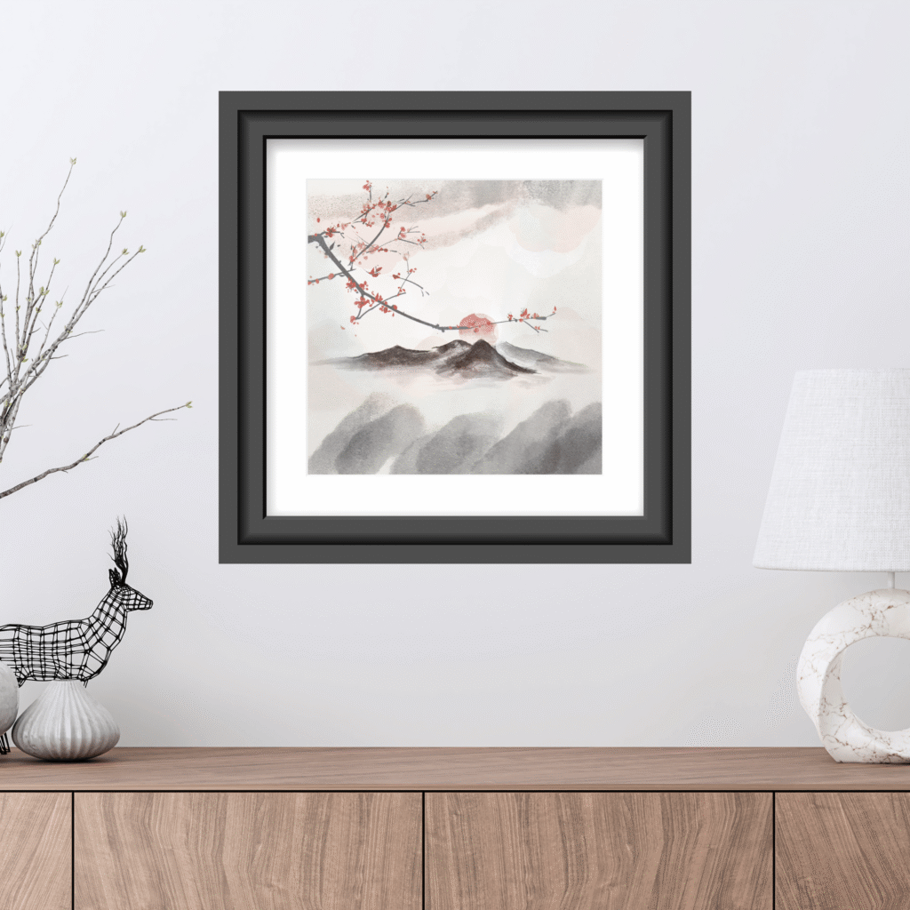
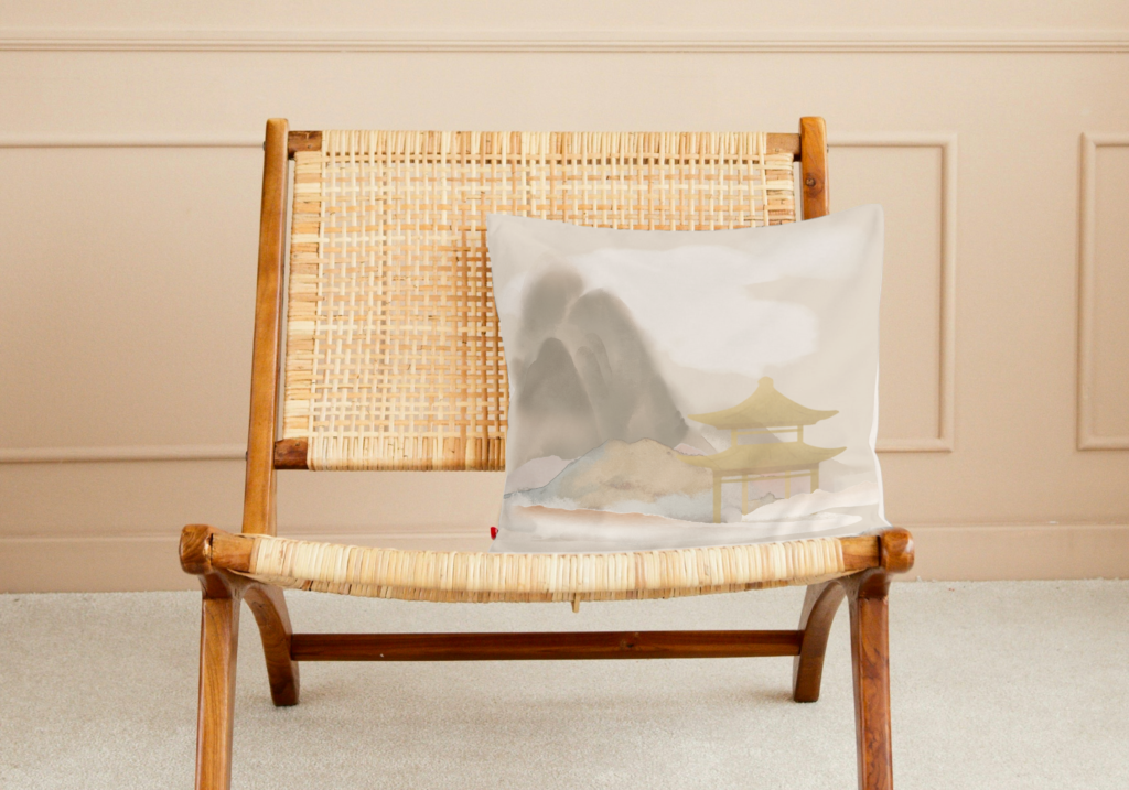
- Misty Landscapes: Mountains fading into fog. The fog is the Ma.
- Minimalist Botanicals: A single branch of cherry blossoms across a vast white page.
- Abstract Washes: Swaths of color that fade into nothingness, leaving the majority of the paper untouched.
- Solitary Figures: A lone fisherman in a boat surrounded by an empty lake.
Step 2: Embrace Wabi-Sabi – Selecting the Right Color Palette
Color is the most powerful tool you have for manipulating the perception of space. In a small apartment, color dictates mood, depth, and continuity.
My Actionable Advice:
- Go Earthy and Muted: Wabi-Sabi favors the colors found in nature after a rainstorm—faded greens, soft ochres, warm clay tones, slate greys, and deep indigos. These colors are grounding. They do not assault the senses.
- Use Cool Colors to Expand: Soft blues and greens are known to recede visually. A wall painted soft blue feels farther away than it is. Similarly, a watercolor with a cool, calming palette will create an illusion of depth.
- Warm Colors for Intimacy: If you want to create a cozy corner, look for watercolors with warm earth tones (terracotta, burnt sienna, warm beige). These advance slightly, making a space feel more intimate and hugged.
- The “One Palette” Rule: In a small apartment, your eyes can see multiple rooms at once. I recommend trying to keep your art palette cohesive. If you have a cool, grey-green living room, a watercolor with a bright neon orange frame might look like a mistake rather than a statement. Choose art that lives within the same color family as your room, or that pulls an accent color from your existing decor.
What I suggest you look for:
- Washes of indigo and sumi ink.
- Abstract landscapes in sage green and dusty rose.
- Botanical studies in muted sepia tones.
Check out Wabi-Sabi Color Palettes: 5 Reasons Why Red Accents Work in Zen Interiors and 5 Mistakes to Avoid to learn how to integrate red into your wabi0sabi color palette.
Step 3: Invite Shanshui – Bringing Nature In
You do not need a literal mountain painting to bring Shanshui into your home. You need the feeling of mountain and water—stability and flow.
My Actionable Advice:
- Think Elemental, Not Literal: Look for art that evokes natural elements. A watercolor with vertical strokes might evoke a waterfall or rain (water energy). A piece with a solid, dark form might evoke a mountain or cliff (earth energy).
- Consider the Seasons: In East Asian art, the season depicted is a crucial part of the meaning. Spring (cherry blossoms) represents renewal. Autumn (maple leaves) represents reflection. Choose a season that resonates with the mood you want in that room.
- Abstract Nature is Okay: You do not need a realistic tree. A simple brushstroke that suggests the movement of wind through grass is often more powerful than a detailed illustration because it leaves room for the imagination (Ma).
What I encourage you to look for:
- Ink wash paintings of bamboo (resilience, flexibility).
- Watercolor studies of water lilies (purity, peace).
- Abstract pieces with flowing, organic lines.
Step 4: Scale and Placement – Respecting the Space (Ma in Practice)
This is where the rubber meets the road. You have chosen your piece. Now, where does it go?
My Actionable Advice on Scale:
- The “One Big Piece” Strategy: This is the most effective trick I know in interior design. One large piece of art (24×36 inches or larger) reads as a focal point. It simplifies the wall. One large piece with good Ma will make a room look significantly larger than three small, cluttered pieces. The large art becomes a “window,” while the small art becomes “noise.”
- The Small & Precious Strategy: Conversely, a very small piece (4×6 inches) can be incredibly effective, but only if you give it space. A tiny watercolor on a huge wall, if centered correctly, creates a moment of intimate focus. It draws you in. This works best in hallways, reading nooks, or above a small desk.
My Actionable Advice on Placement:
- Height Matters: The center of the artwork should ideally be at eye level (approximately 57-60 inches from the floor). This is gallery standard. However, in a room where you are often seated (like a living room), I recommend hanging it slightly lower so it relates to the seated eye level.
- Furniture Relationship: If hanging art above a sofa, bed, or console table, the art should be about 2/3 the width of the furniture. This creates a visual connection. Hang it 6-8 inches above the top of the furniture so it feels connected to the piece, not floating aimlessly above it.
- The Lean: For a relaxed, collected look, I am a big fan of leaning your watercolor against the wall on a shelf, mantel, or sideboard. This is inherently casual and adds a layer of depth to the room. It also requires zero measuring and allows you to swap art out easily.
Practical Tips for Buying, Framing, and Lighting
You have the philosophy and the placement strategy. Now, let’s handle the logistics to ensure your chosen art looks its best.
Framing: Keep It Simple
The frame is the bridge between the art and your wall. It should guide the eye to the art, not block it.
- Thin Profiles: In a small apartment, thick, heavy frames consume visual real estate. I always recommend choosing slim profiles. A thin wood or metal frame allows the airy quality of the watercolor to extend to the edges.
- Natural Materials: Wood frames in oak, walnut, or bamboo align perfectly with Wabi-Sabi and Shanshui aesthetics. They bring another layer of natural texture to the room.
- Matting is Your Friend: A mat (the cardboard border between the art and the frame) creates more Ma. It gives the art even more breathing room. A white or off-white mat is a classic choice for watercolors, as it mimics the white of the paper and enhances the luminosity of the paint.
- Avoid Glare: I suggest asking your framer for non-reflective glass or acrylic (often called Museum Glass or Optium Acrylic). This is crucial in a small, potentially sunny apartment where glare can completely obscure a delicate wash of color.
Lighting: The Final Touch
Art needs light to live. In a small apartment, lighting is also a key tool for creating ambiance.
- Picture Lights: A small, dedicated picture light mounted above the frame does two things. First, it highlights the art, making it a true focal point. Second, it adds a warm layer of light to the room, reducing shadows and making the space feel larger and more inviting.
- Track Lighting: If you have a gallery wall or a few key pieces on one wall, a simple track light can be adjusted to shine directly on them.
- Natural Light Caution: I have to mention this: never hang valuable watercolor art in direct sunlight. UV rays will fade the pigments over time. Choose a wall that gets indirect light, or invest in UV-protective glass.

Where to Find Art (with an East Asian Soul)
You now know what to look for. Here is where I personally look for it.
- Etsy: I search for terms like “minimalist ink wash,” “original watercolor landscape,” or “Wabi-Sabi abstract.” I filter by shops located in my region to save on shipping.
- Local Art Fairs: Many cities have art walks or weekend markets. I love meeting artists directly and seeing the texture and scale of the work in person.
- Museum Stores: Online stores for museums (like the Met, the British Museum, or Asian art museums) often sell high-quality prints of classical East Asian watercolors and ink paintings.
- Create Your Own: You do not need to be a master. I have tried this myself, and I can tell you that simple brush strokes on quality paper can be incredibly meditative and personal. This is the ultimate expression of Wabi-Sabi.
Conclusion: Your Small Apartment as a Sanctuary
I believe that choosing art for a small apartment is not a compromise. It is an opportunity to practice intentionality.
By applying the principles of Ma, you learn to value empty space as a luxurious commodity, choosing art that breathes rather than shouts.
By embracing Wabi-Sabi, you welcome authenticity and warmth, rejecting sterile perfection in favor of organic, human beauty.
By inviting Shanshui, you reconnect with the natural world, creating a psychological escape from the confines of urban living.
Your walls are not just boundaries; they are the canvas for your daily life. Every time you glance at the soft wash of a mountain peak or the simple stroke of a bamboo leaf, I hope you remind yourself to breathe, to pause, and to appreciate the space you have.
I hope this guide has given you the confidence to choose art that truly transforms your home. Remember, the goal is not to fill the space, but to define it.